[Jim Nance voice] The asset allocation quilt — a tradition unlike any other.
This is the past 10 years with an update for 2020:
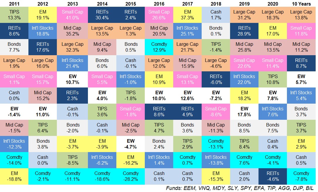
*Reminder: EW = an equal-weighted portfolio of every asset on the quilt
Some thoughts:
2020 was a weird year. One of the more surprising moves in 2020 to me was the fact that the Russell 2000 Index of small companies outperformed the S&P 500. Yet you’ll notice on the asset allocation quilt that small caps underperformed large caps by quite a bit.
What gives?
The Russell 2000 outperformed the S&P 600 by nearly 9%. This is getting into wonk territory but the Russell 2000 holds more microcaps than the S&P 600 Small Cap Index. And micro caps actually outperformed small caps, mid caps and large caps in 2020:
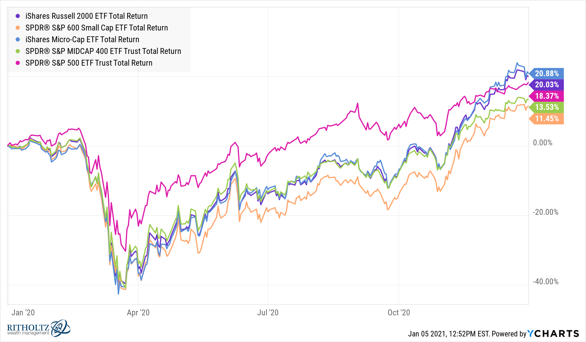
It was a weird year in the markets.
It’s been a tough run for commodities. My summation of the past 10 years for commodities:

A diversified basket of commodities has been the worst or second-worst performer on this list 9 out of the past 10 years. The best showing was third from last in 2018. There are many reasons for this but the simple fact is we haven’t had much inflation so commodity prices have suffered.
A loss of close to 8% per year over a decade equates to a total return from 2011-2020 of -55%.
The consistency of the S&P 500 is impressive. The S&P 500 is basically the opposite of commodities. For this entire 10 year period large cap U.S. stocks have been in the top 3 of these asset classes every single year, including the top slot the past two years.
And the crazy thing about the outperformance is the volatility of annual returns is lower for the S&P than its equity counterparts:
- S&P 500: 12.3%
- Small caps: 14.7%
- Mid caps: 14.0%
- Foreign stocks: 14.8%
- Emerging markets: 18.8%
Commodities even have slightly higher volatility than the S&P 500 from 2011-2020 (12.4% to 12.3%). So large caps in the U.S. are outperforming and doing so with lower volatility.
The S&P 500 is now up 16 out of the past 18 years, with the only down years in 2008 (-37%) and 2018 (-5%).
That’s a pretty good run for big U.S. corporations.
What a difference a year makes. You can always change someone’s mind about the markets by simply changing the start and end dates for your return series.
I’ve been tracking this data since 2008. It’s interesting to see how the annual numbers change when you go back 13 years (2008-2020) and 12 years (2009-2020) for these asset classes:
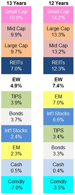
Even with 2008 included the returns across the market capitalizations in U.S. stocks have been strong but you can see how big that jump up is when the huge down year falls off.
No big takeaways from this data beyond the fact that plus or minus one year here and there can make a large difference when it comes to performance.
Where’s bitcoin? Every year someone asks me this. Yes bitcoin destroyed all of these asset classes in 2020, rising more than 300%. It would have also had the best return in 2019, the worst return in 2018 and the best return in 2017.
But the asset allocation quilt committee is rejecting bitcoin’s application at this time because it was basically impossible to any normal investor to put money into it before, I don’t know, 2015?
Unless you knew someone in the tech space or were a tech savant yourself all of those glorious returns from the low prices of the early 2010s were for people who truly understood how it worked.
We will be reassessing in 2025.
Further Reading:
Updating My Favorite Performance Chart For 2019