The first asset allocation quilt I put together was in 2014. I’ve updated it every year since then. It’s become an annual tradition to forget about it until a few people email me asking for an update. We’ve already reached that point in the new year so here are the latest numbers:
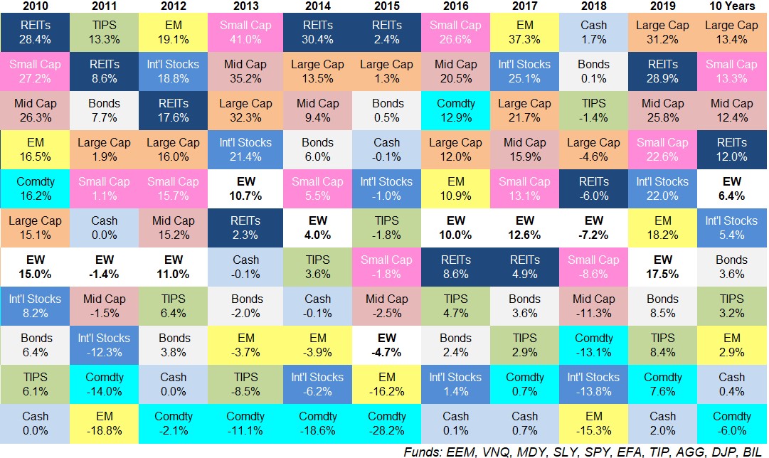
(EW = an equal-weighted portfolio of every asset class listed here)
As stated previously, 2018 was the year nothing worked so it’s no surprise 2019 was the year everything worked. If you lost money last year I don’t know what to tell you.
Here are some more thoughts on these numbers:
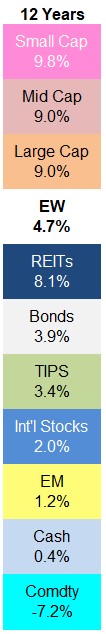
The gap between best and worst performers is huge. The best performing asset class of this group (large cap U.S. stocks) outperformed the worst (cash) by more than 29% in 2019 and that’s actually below the average range of the past 10 years.
The average difference between the best and worst performer of the 10 asset classes used here since 2010 is 32.3%. The biggest difference between top and bottom performers came in 2013 when small cap stocks outperformed commodities by more than 52%.
This tells us diversification is not dead by a long shot but it also shows how many opportunities investors have to be either really right or really wrong if they go to the extremes in any one asset class or region.
The bond market didn’t collapse. Bond returns haven’t been anything to write home about over the past decade. 3.6% annually for the Barclays Aggregate and 3.2% for Treasury Inflation-Protected Securities (TIPS) are nothing like the returns investors experienced in the 1980s, 1990s or 2000s.
But those returns came with roughly 75% lower volatility than the stock market over this time. The largest drawdowns were just 5% and 11% respectively, for the Aggregate and TIPS while the S&P fell close to 20% on two different occasions.
And bond investors weren’t crushed by inflation, the death of the fiat currencies, government debt levels, or “money printing” by the Fed. These are all things the doomsayers were warning about in 2008, 2009, 2010, 2011, 2012, 2013, 2014, and you get the picture.
I’ve had numerous discussions with investors over the past decade where I talked them off the ledge when it came to their worries about the bond market. Other times I couldn’t assuage those fears. You would be surprised how many people have been more worried about the risks in fixed income than the stock market since the financial crisis.
Because of the current level of interest rates (even lower now than when the last decade started), long-term returns for bonds will continue to be lower than they were in the past. But that doesn’t mean the bond market is going to blow up.
Returns look pretty good even if we include 2008 numbers. I’m using the past 10 years of returns here so the 2009 numbers dropped off from last year. That means the 2008 market debacle is turning into a distant memory for many investors. But even if we include the 2008 crash when stocks fell anywhere from 37% to 49% depending on the region, returns still look decent:
If you would have put money into the S&P 500 the day before Lehman filed for bankruptcy in the fall of 2008, right before things started to get really messy, you would still be up nearly 230% from there. And that includes a further 45% drawdown before stocks bottomed in March 2009.
Of course, the decent numbers since 2008 are only in the United States. Foreign developed and emerging market stocks haven’t experienced nearly the same recovery as U.S. shares. And commodities have been an absolute disaster as a group since 2008.
EM and U.S. stocks completed a massive flip flop from decade to decade. From 2000-2009 emerging market stocks were up 162% in total versus a 9% loss for the S&P 500. This relationship completely reversed this past decade, as emerging markets were up just 49% compared to a gain of 257% for the S&P 500.
This relationship doesn’t always work so neatly but it does go to show why looking at the best performer, even over decade-long periods, can be misleading when making asset allocation decisions about the future.
Returns over the past 10 years in the U.S. look amazing while EM returns look dreadful in comparison. This could certainly continue but don’t assume just because things have been great for U.S. stocks for 10 years that they will always be at the top of the heap.
Real estate has had a nice comeback performance. I’m guessing plenty of investors would be surprised to discover REITs have been such strong performers over the past 10 years. It makes sense when you consider U.S. stocks have performed so well and interest rates have fallen (since REITs act like a combination of equities with higher yields).
But the real estate industry was absolutely massacred during the financial crisis. While the S&P 500 fell close to 56% during the 2007-2009 financial crisis, REITs were down roughly 75%.
The high returns ever since then obviously have something to do with the fact that the shares in this asset class were so beaten down but I’m not sure too many investors were willing to get in the way of that falling knife during the crisis.
Further Reading:
My Evolution on Asset Allocation