The annual update of my favorite performance chart drew a number of good responses and questions. I’m going to go through two that I thought were worth some more digging:
Question 1: Can you take this allocation quilt back 20 years?
The past 10 years have felt like complete and utter domination by large cap U.S. stocks. So a handful of people asked me to take the data back to include the prior 10 years. Here it is going back to the turn of the century:
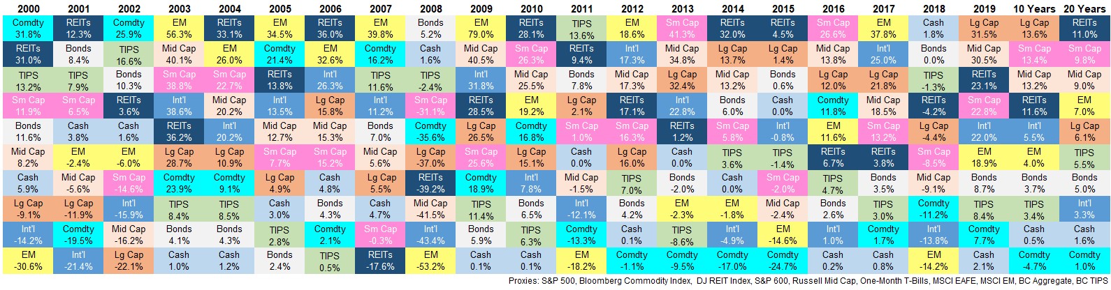
(please note I’m using index data here whereas on my previous quilt I was using ETFs since many of those ETFs don’t go back to the year 2000)
This chart is much wider and therefore may be harder to read so allow me to summarize:
Large cap U.S. stocks have dominated but not as much as most investors assume. The first thing that stood out to me from this chart is large cap U.S. stocks (in organge) basically go from bottom left in the early 2000s to top right by the late-2010s.
The terrible previous decade was followed by a glorious run this past decade.
Small and mid caps stocks have kept up over the past 10 years and handily outpaced larger stocks since 2000 (while REITs were surprisingly the strongest 20 year performers), The majority of the S&P 500 relative outperformance has come in recent years. The S&P 500 has outperformed both small and mid cap stocks by roughly 17% in total since 2015.
Emerging markets and commodities had a much better decade in the 2000s than the 2010s. Emerging markets were up 10.1% per year from 2000-2009 while the Bloomberg Commodities Index rose more than 7% annually in that time. Much better than the 4.0% and -4.7%, respectively in the ensuing decade.
And that run for emerging markets from 2003-2007 is bananas. The MSCI EM Index was up close to 400% in those 5 years at a time when the S&P 500 gained 83% and the MSCI EAFE Index of foreign developed markets was up 166%.
To say that returns in emerging markets can be lumpy would be an understatement. And the boom/bust nature of commodities is something anyone in that space needs to be aware of.
Correlations don’t always go to one during a market crash. In 2008, cash and bonds were basically the only main asset classes that went up while everything else got slaughtered. The previous market crash didn’t play out the same way.
The S&P 500 was down three years in a row from 2000-2002 but REITs rose all three of those years. Small cap stocks were up those first two years of the bear market while commodities rose two out of three years as well. International stocks didn’t hold up as well but emerging markets held up admirably in 2001 and 2002 with minimal losses.
Many investors expect the next market crash to play out exactly like the Great Financial Crisis but that’s probably not going to happen. I’m not saying the dot-com bear market is the playbook either but there are situations where diversification can protect investors during a downturn more than most assume.
Remember when cash used to yield something? One-month t-bills paid out almost 6% in 2000 and close to 4% in 2001. Last year investors cheered when rates almost hit 2% in their short-term savings accounts.
Foreign developed markets have been a disappointment for two decades. No matter how you slice it, the broad-based foreign markets (MSCI EAFE) have been disappointing this century.
There are reasons for this and sometimes this is what happens with risk assets but 3.3% annual returns over 20 years is rough.
Question 2: Can you just show the worst asset classes and strategies each year?
My original quilt has 10 asset classes so I wanted to expand this to include a number of other asset classes and strategies. I ended up with 30 asset classes.1 Here are the 5 worst performing asset classes every year since the year 2000:
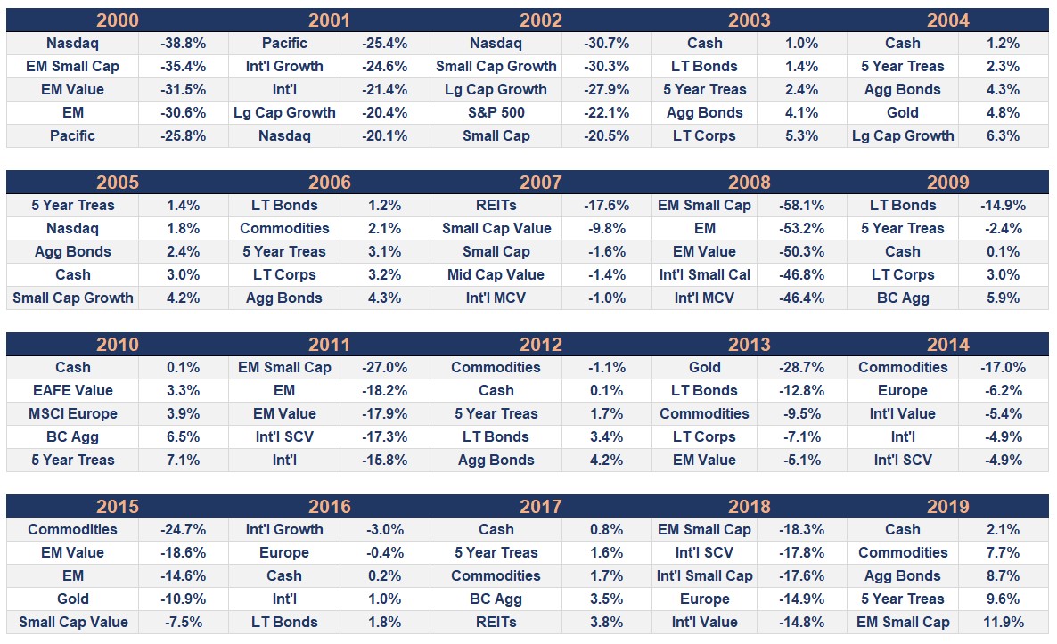
Some thoughts:
Pretty much everything takes a turn at the bottom of the heap. Bonds and cash show up in this list more than any other asset class, which makes sense during big up years in the stock market.
But no style or asset class is immune for poor years in the markets.
Catching a falling knife has mixed results. I looked at the ensuing calendar year performance for the worst-performing asset class in a given year (excluding cash and intermediate-term bonds).
The average return the following year for the worst performers was a respectable 9% but the results were all over the place.
Emerging market small caps were down 58% in 2008 and rose 114% the next year.
REITs fell 18% in 2007 and a further 39% the following year.
The Nasdaq was down 31% in 2002 (following down years of 39% and 20% in 2000 and 2001) but rose 51% in 2003.
Commodities were down 17% in 2014 but fell an additional 25% the next year.
Those were the outliers but it’s basically feast or famine when it comes to the forward 12 month returns of the worst asset class performers.
Further Reading:
Updating My Favorite Performance Chart for 2019
1The 30 indexes used are: S&P 500, Nasdaq, Russell 2000, Dow Jones REITs, gold, Rusell 2000 Growth, Russell 2000 Value, Russell 1000 Value, Russell 1000 Growth, Russell Mid Cap, Russell Mid Cap Value, Bloomberg Commodities Index, S&P 600, MSCI EAFE, MSCI Pacific, MSCI Europe, MSCI EAFE Growth, MSCI EAFE Value, MSCI Emerging Markets, MSCI EAFE Mid Cap Value, MSCI Small Cap Value, MSCI Emerging Markets Small Cap, MSCI EAFE Small Cap, MSCI Emerging Markets Value, Long-Term Government Bonds, Long-Term Corp. Bonds, 5 Year Treasuries, Bloomberg Barclays Aggregate, One Month T-Bills. I obviously still missed some but figured this list covered most of the bases.