NYU professor Aswath Damodaran offers an impressive array of investment tools available for anyone to use for free:
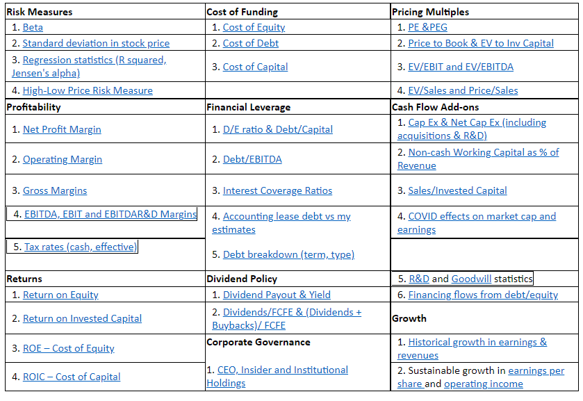
Most of this data is fairly targeted and probably only useful for fundamental investors doing deep dives on the market.
I’m not afraid to get my hands dirty but I tend to use the simple stuff more often when it comes to historical market data.
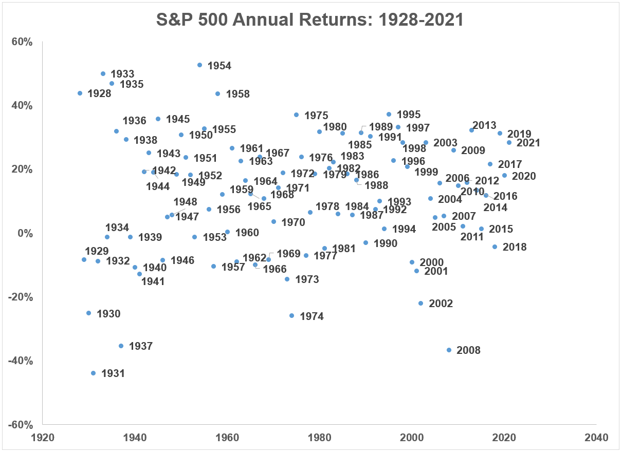
My favorite dataset from Damodaran is his annual update of the historical returns on stocks, bonds and cash. He shows total return data for the S&P 500, 10 year treasuries and 3-month t-bills each year going back to 1928.1
Let’s look at some of the charts and tables we can create from this data:
This scatterplot of the calendar year returns shows how widely stock market performance can vary from year to year:
This variation becomes even clearer when you compare the best, worst and average returns of the stock market to bonds and cash:
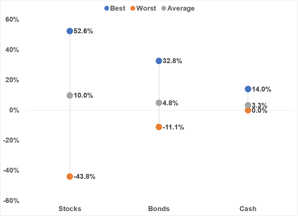
The wide range of returns is one of the biggest reasons the average return of stocks is so much higher than bonds and cash.
Bonds don’t have nearly the same amount of variance in returns as stocks because of the way fixed income is structured. Bond returns are much easier to predict over the long-term than stocks.
All you have to do is use the starting yield and that gives you a fairly reliable expected return number over the ensuing 5-10 years.
But there can be some short-term volatility in bond returns when rates move up.
This is a list of the 10 worst calendar year returns for 10 year treasuries since 1928:
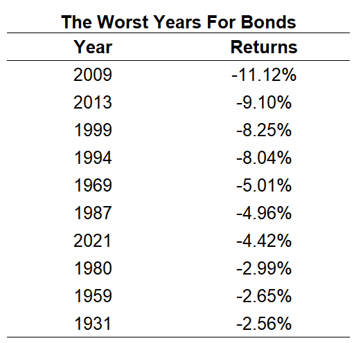
That’s just one double-digit down year compared to 11 down years of 10% or worse for the stock market in the same time.
It’s interesting to note 3 of the worst 10 years over the past 94 years have come since 2009. I would expect this to continue in the years ahead as bonds are more volatile with interest rates so low.
Here are those 11 double-digit losses in the stock market compared to the returns of bonds in those same years:
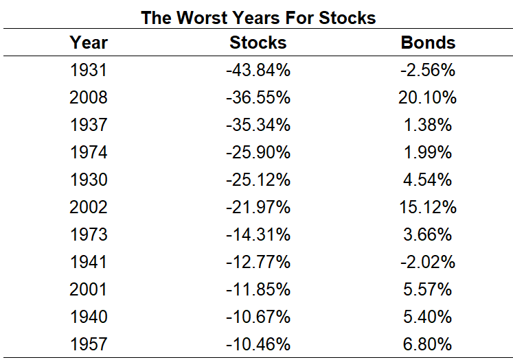
The average loss in stocks over these years was -23%. In those same years, bonds were up an average of 5.5%, an outperformance of 28%.
There were two years on this list when bonds fell at the same time as stocks but those “bad” years in fixed income were a bad afternoon in the stock market.
You can also break up these returns into different cycles to show why the historical returns for bonds and cash were much higher in the past than they are likely to be in the future:
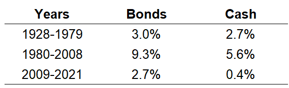
Interest rates got so high in the early-1980s that bond and cash returns over the ensuing decades were lights out.
Never say never but it’s highly unlikely we will ever see returns this high for this long on safe assets again.
And finally a reminder to keep a long-term perspective as we go through yet another market correction.
Damodaran also publishes the growth of $100 invested in stocks, bonds and cash starting in 1928. This period includes the Great Depression, multiple wars, 15 recessions, and a handful of 50%+ market crashes.
Yet in that time $100 invested in the stock market in 1928 grew to more than $760,000 by the end of 2021.
Not bad.
Michael and I talked about Damodaran’s data and much more on this week’s Animal Spirits video:
Subscribe to The Compound so you never miss an episode.
Further Reading:
Updating My Favorite Performance Chart For 2021
Now here’s what I’ve been reading lately:
- Nostalgia for Blockbuster (Irrelevant Investor)
- Why own bonds in a portfolio anymore? (Humble Dollar)
- Learning from your money mistakes (Abnormal Returns)
- The high cost of an easy job (Dollars and Data)
- Don’t blame the Fed, adjust your plans (Howard Lindzon)
- 10 facts colleges don’t want you to know about admissions (A Teachable Moment)
- The dual casting magic at the hear of Yellowjackets (The Ringer)
1Damodaran has also added corporate bonds and real estate in recent years.