Pope Gregory XIII introduced the Gregorian calendar in 1582. It wasn’t perfect at first because the scientist who developed it for him forget to include leap years, meaning the calendar was slightly too long to match up perfectly with the movements of the solar system. This is because the earth rotates 365.25 times as it revolves around the sun.
The number of rotations the earth makes while hurtling through space around the sun should have no bearing on the financial markets. There’s nothing special about quarterly performance numbers.
One year returns don’t tell us much in the grand scheme of things. Even decade-long stretches may not be enough to definitively answer questions we have about the markets or the performance of our portfolios.
But that’s not going to stop the finance industry from paying attention to these self-imposed time constraints.
And you know what?
I don’t mind breaking things up periodically like this to think about the markets. Short-term performance metrics are less than useless but breaking the longer-term down into more digestible time frames can help put things into perspective when trying to comprehend what’s been going on in the markets.
I’m one of these people who has grown to love the year-end and decade-end reviews of all things markets. And it just so happens that 2019 gives us the opportunity to do both.1
The crack research staff at YCharts put together some of their favorite charts of the past decade to show just how things have changed in the 2010s in a variety of ways.
This chart may be the best news of the decade:
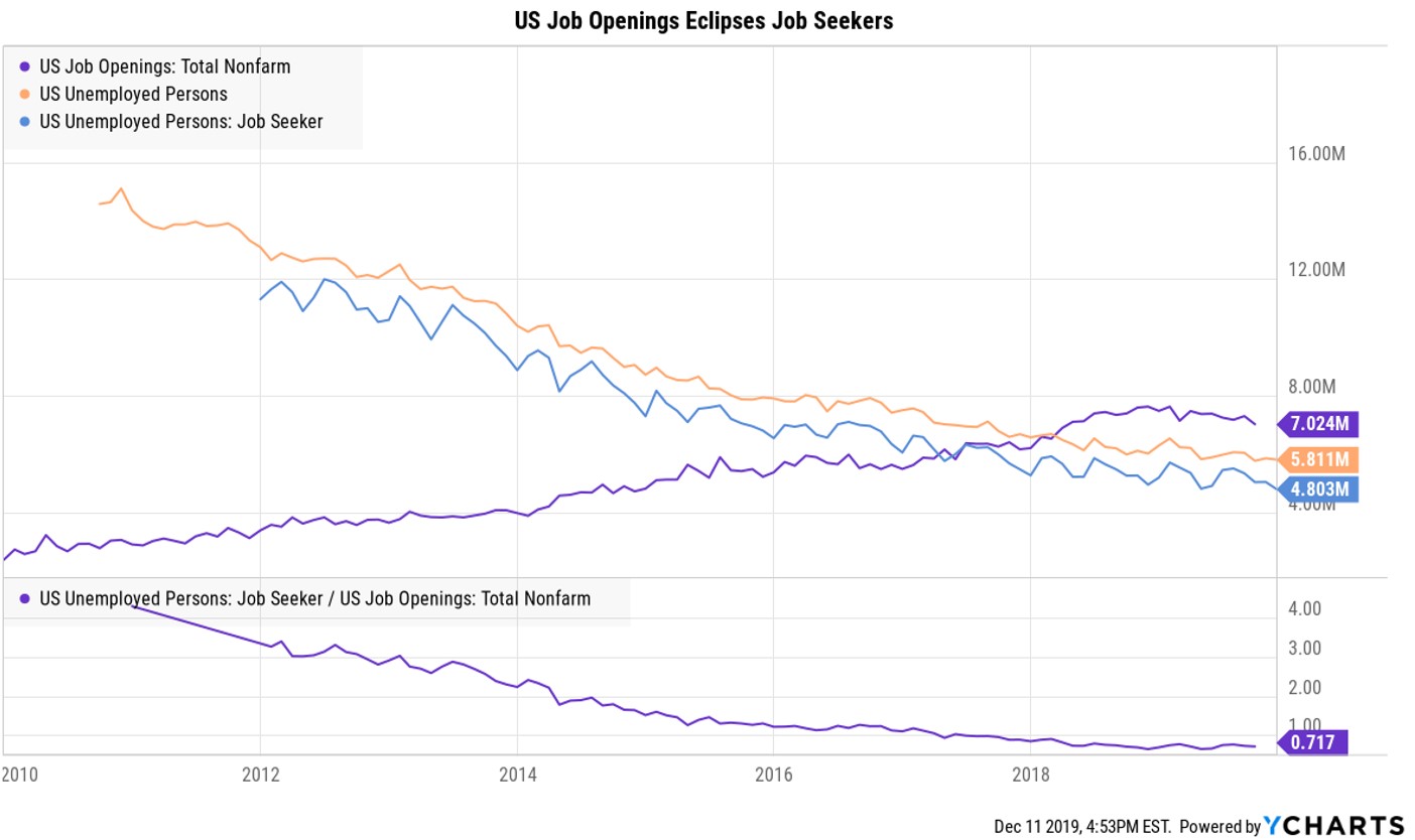
We went from a situation in which there were far more people out of work and looking for a job than there were jobs available in this country. That relationship has completely flipped in by the end of the decade. The unemployment rate peaked in the fall of 2009, just before the onset of this decade and the trend for job growth and the growth in job opportunities has been going in the right direction ever since.
Collectively, this may be the best economic news of the decade.
Following the central bank intervention during the financial crisis, many were quick to proclaim the onset of hyperinflation and the death of the U.S. dollar wouldn’t be too far behind. The tinfoil hat crowd may have to wait just a little longer for the dollar to collapse:
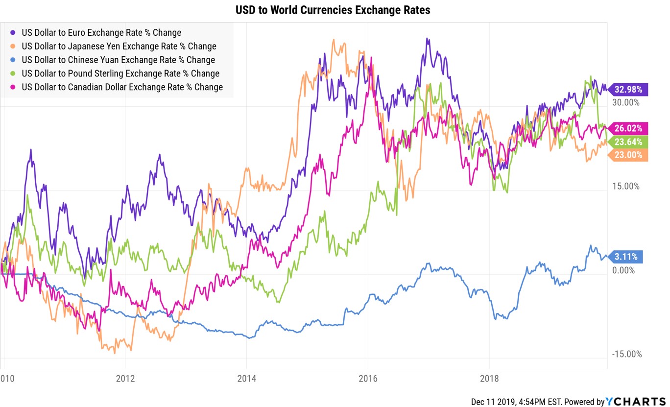
The dollar has strengthed against all of the major currencies, in some cases considerably. Most Americans wouldn’t be able to tell what this means for them on a day-to-day basis but the strength or weakness of the dollar does have an impact on your investments.
Typically, a strong dollar has meant strong U.S. equity markets and weak foreign stock market performance. This is especially true for U.S. investors because when you invest in a foreign company, that investment has to be converted back into USD for your account. And this is exactly what happened over the past decade. U.S. stocks have crushed foreign stocks. If you do hold international stocks, your best bet over the next decade is a weaker U.S. dollar to increase the value of your foreign holdings.
Surprisingly, even during a bull market and economic expansion that has now become the longest in history, debt growth for consumers has slowed from the previous decade:
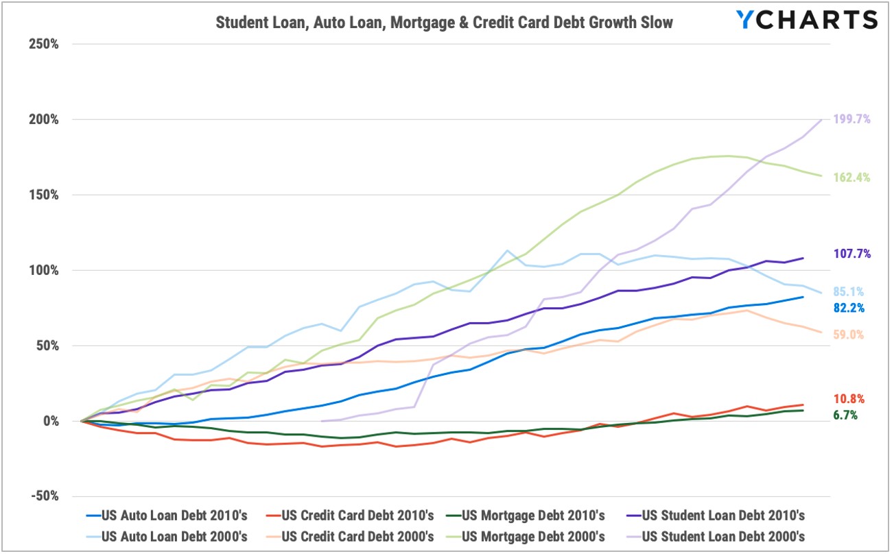
Maybe U.S. household debt isn’t as bad as some make it out to be?
This one may surprise some people:
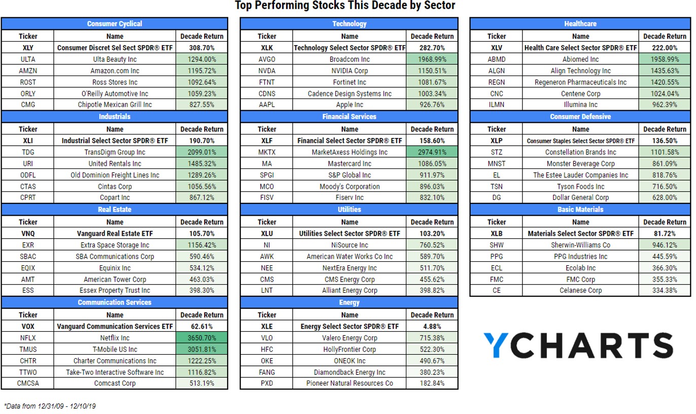
Consumer discretionary is the best-performing sector of the S&P 500 over the past decade, beating out technology stocks. It should be noted that Amazon is now considered a consumer discretionary company because it’s becoming harder and harder to label many of these stocks but the point remains. The massive returns in these top-performing companies are one of the reasons stock-picking will never go away for good. It’s far too tempting to pick these types of home runs stocks.
I wonder how many people who don’t pay much attention to the stock market realize the S&P 500 is up 9 out of 10 years this past decade:
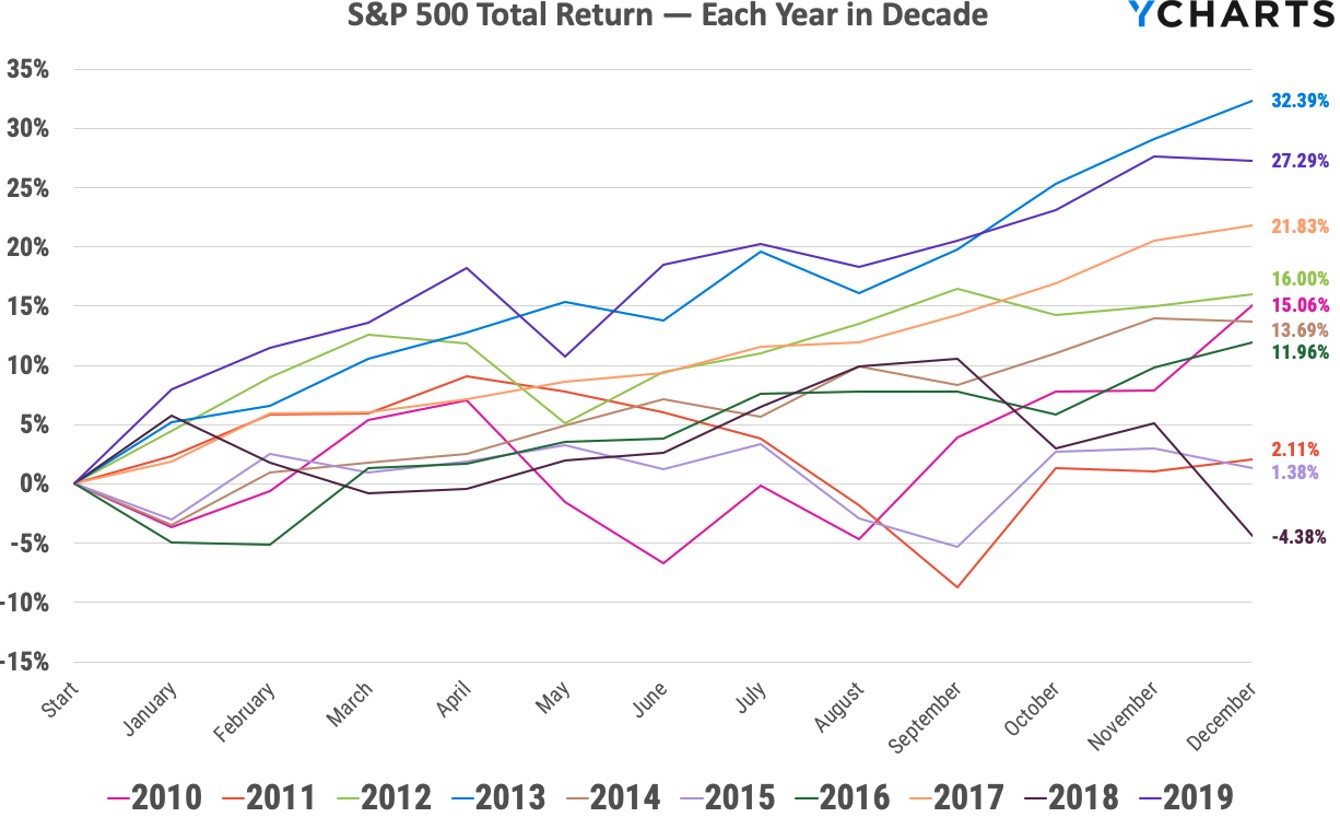
The S&P is also up 15 of the past 17 years, with the only other down year since 2003 coming in 2008. This gets back to the rotation around the sun stuff but this is kind of mindblowing when you think about how volatile things have felt over the past decade and change.
This one surprised me:
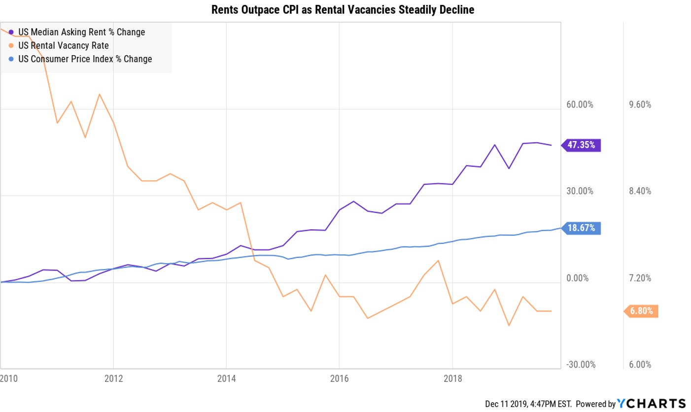
I’m sure there are plenty of caveats required when looking at the increase in rent over the entire nation but the fact that rents have been rising are more than twice the level of inflation made this a pretty great decade to own housing, especially when you consider how low interest rates are on mortgages.
Here’s one for cocktail party conversation starters at your upcoming holiday parties:
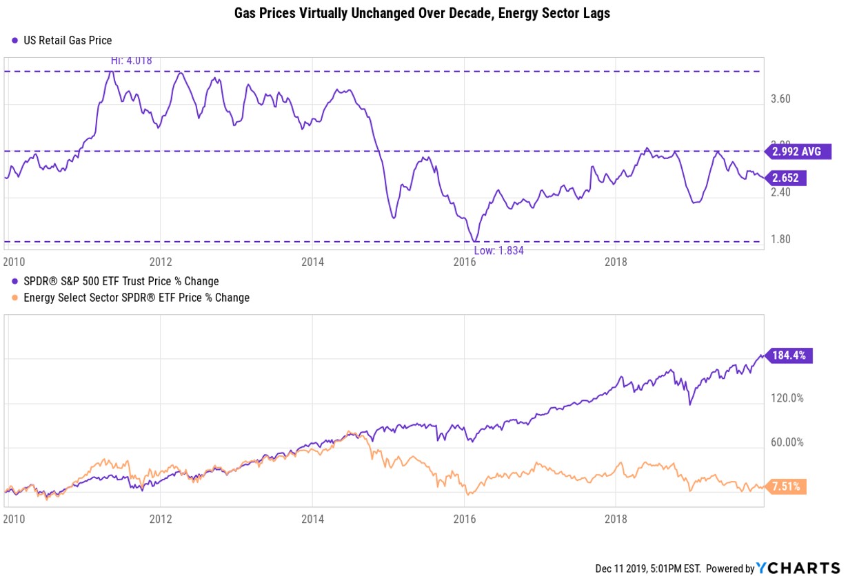
This makes sense considering the price of oil hasn’t done much this decade but many people would be surprised to know gas prices are effectively exactly where they were at the start of this decade. It was a lost decade for gas prices which is a win for the consumer’s pocketbook.
Further Reading:
For Investors, the Past Decade Was a Marvelous Run. But That Only Tells Half the Story
1Some people have tried to tell me we actually have another year to go in this decade because there was no year zero. I’m choosing to ignore this faulty logic because it messes with the numbers and I like my numbers clean. Data mining? Too bad.