“We tend to be inadequate historians.” – Robert Frey
A couple weeks ago I covered a little discussed topic involving the the use of historical market data. Namely that you have to take market returns that go back to the turn of the 20th century with a grain of salt because of the fact that costs were much higher in those days so no one was really receiving those gross returns on a net basis.
The natural follow-up question to this line of thinking would be — so what does stock market data going back to the 1800s really tell us?
A reader sent me a link to a video of a presentation given by former hedge fund manager and quant Robert Frey (whose firm was actually bought out by legendary hedge fund manager Jim Simons in the 90s) called 180 Years of Market Drawdowns.
Frey discusses the many changes that have taken place in the stock market over the years — the creation of the Fed, monetary policy, fiscal policy, the end of the gold standard, tax rates, valuations, the industry make-up of the markets and a number of other things.
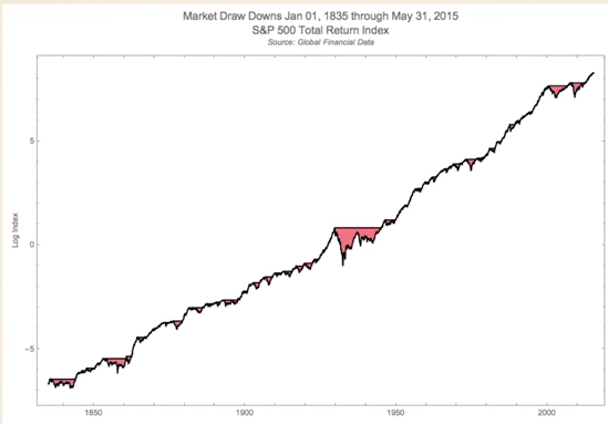
But there has been one constant going back all the way to the early 1800s — risk. More specifically, drawdowns or losses. Frey presented a couple of different charts on the market to make his point. First, here’s the long-term growth of the stock market with losses shaded in red:

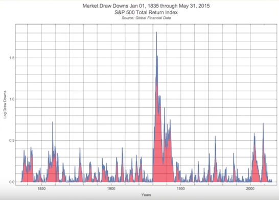
Looks pretty good to me. But now here are those losses visualized in another way without the benefit of a log scale chart:

Obviously the crash during the Great Depression stands out here, but look at how consistent losses have been over each and every decade or economic environment. Losses are really the one constant across all cycles.
Frey says in his talk that in stocks, “You’re usually in a drawdown state.”
Stocks don’t make new highs every single day, so most of the time you’re going to be underwater from your portfolio’s high water mark. This means there are plenty of chances to be in a state of regret when investing in stocks.
This makes sense when you consider that stocks are positive just a little over half the time when looking at returns on a daily basis, but it can be difficult to wrap your head around this fact.
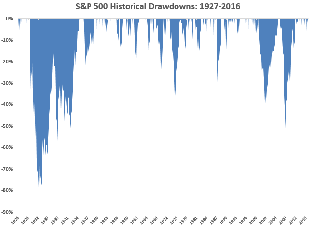
I don’t have data going back to 1835, but I was able to calculate the drawdowns on the S&P 500 going back to 1927 to add some more context to Frey’s chart from above:

I used monthly total returns on stocks for these numbers and found that an investor would have been down from a prior peak over 70% of the time. The majority of your time invested in stocks could be spent thinking about how you coulda, shoulda, woulda sold at that previous high price (which of course gets taken out to the upside eventually).
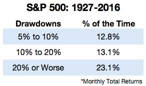
Here’s the further breakdown by the size of the loss:

Over the last 90 years or so the market have been in a bear market almost one-quarter of the time. Half the time you’re down 5% or worse. It’s difficult to appreciate this fact when looking at a long-term log scale stock chart that seems to only go up and to the right.
This is why stocks are constantly playing mind games with us. They generally go up but not every day, week, month or year.
No one can predict what the future returns will be in the market. No one knows what the future holds for economic growth. And we certainly can’t predict how investors will decide to price corporate cash flows at any given point in time out into the future.
But predicting future risk is fairly easy — markets will continue to fluctuate and experience losses on a regular basis. As an investor in stocks you will spend a lot of time second-guessing yourself because your portfolio has fallen in value from a previously seen higher level.
In a sense risk is easier to predict than returns.
Market losses are the one constant that don’t change over time — get used to it.
Source:
180 Years of Market Drawdowns
For more on this subject read what Tadas Viskanta at Abnormal Returns has to say on historical performance numbers:
Steph Curry, Michael Jordan and the equity risk premium

I wrote a comment here: https://awealthofcommonsense.com/2016/04/tales-from-manager-due-diligence/
Do you mind reading it please…
Outstanding graphs and commentary. Thanks for sharing it.
This seems to me an extremely useful article. Thank you very much.
With high correlations among equities, it strongly suggests to me that investors pay more attention to time-diversification.
Good one. I like that phrase