“Rule number one: most things will prove to be cyclical. Rule number two: some of the greatest opportunities for gain and loss come when people forget rule number one.” – Howard Mark
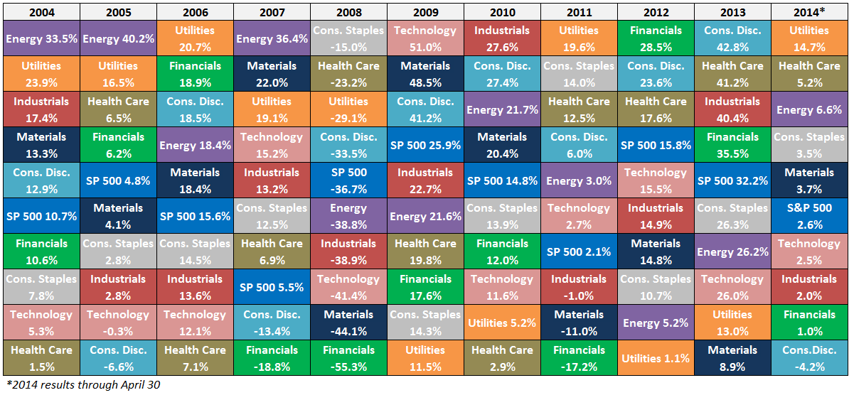
Here’s a breakdown of the S&P 500 sector ETFs ranked from best to worst performance by year over the past decade along with the first four months of 2014 (click to enlarge):

Some observations on this data:
- As with any asset allocation quilt, this data makes you realize how fleeting leadership can be in the financial markets. There seems to be little rhyme or reason from one year to the next.
- There have been 7 different sectors with the best returns over the past 7 full calendar years.
- For those that dislike the banks, here’s something to hang your hat on – the financials had by far the worst returns of any sector from 2004-2014 with a total return of -3% versus the S&P 500’s gain of 108%.
- One of the best performers over this period was the consumer discretionary sector. One of the narratives following the financial crisis was that the consumer was tapped out from the debt overhang. From 2009-14, consumer discretionary stocks were up nearly 222% versus the S&P’s gain of roughly 130% (Although that trend has finally reversed this year).
- Another story investors should have ignored? Remember when Obamacare was going to crush health care stocks under a cloud of uncertainty? This sector is up roughly 100% in the last three years and change despite the uncertainty surrounding the health care bill.
- The performance of these two sectors shows how often following the story on the news can be detrimental to investment decisions. Expectations matter in the financial markets. It’s not just absolute growth or a single news item that moves stocks. It’s the relative growth in relation to expectations and how much of that good or bad news is already priced into the stocks that matters.
- It’s interesting to note that the energy sector outperformed the S&P 500 by nearly 7% per year with nearly the same standard deviation. That’s the kind of risk-adjusted (and absolute) performance hedge fund managers would kill for.
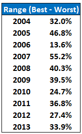
- Many active managers have been complaining about increased correlations and low dispersion in stocks for the past few years as a reason for underperformance. The claim has been that it hasn’t been a “stock picker’s market.” Well, the range between the top and bottom performing sectors has been huge:

That’s an average difference of 35% between top and bottom performing sectors. Just pick the right sectors and you don’t really have to worry about stock picking (obviously easier said than done).
The takeaway here is that most active managers track too closely to benchmark sector weights, making it much harder for them to outperform the market. To outperform you must be willing to make investments that are far different than the make-up of the benchmark you are trying to beat.
This is no easy task as career risk and the possibility of years of underperformance can be difficult to stomach, for both portfolio managers and investors.

[…] “This data makes you realize how fleeting leadership can be in the financial markets. There seems to be little rhyme or reason from one year to the next.” (WealthOfCommonSense) […]
[…] Sector Quilt […]
[…] S&P 500 sectors are a ‘crazy quilt.’ (A Wealth of Common Sense) […]
[…] A Wealth of Common Sense makes a good point as it relates to sector leadership over the past couple of years: […]
[…] The S&P 500 Sector Quilt (Wealth of Common Sense) […]
[…] The S&P 500 sector quilt (A Wealth of Common Sense). We don’t call it Sector Rotation for nothing. […]
[…] few months ago I wrote a post about the S&P 500 sector quilt which you can see here updated through June 30, 2014 (click to […]
[…] Further reading: The S&P 500 Sector Quilt […]
[…] The S&P 500 Sector Quilt – A Wealth of Common Sense – @awealthofcs […]
[…] Further Reading: The S&P 500 Sector Quilt […]
[…] average range of returns in the S&P 500 between the top and bottom performing sectors since 2004 is 35%. That’s a huge gap within a broad market index. That means higher rewards if you’re […]