I was doing a little research into the relationship between wages and inflation this week and found a report from 1952 detailing the incomes of families in the United States in 1950.
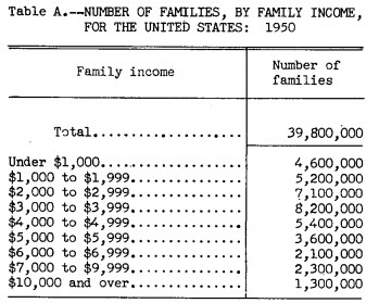
There were nearly 40 million households in the U.S. in 1950. Just 3.3% of those households made $10k or more per year while 77% made less than $5k.
So you could talk all you want about candy bars selling for a nickel or houses selling for $7k back then but the main reason things were so much cheaper is because people made less money.1
People are very scared of inflation today but the trade-off with inflation is you typically see wage growth as well. Since 1950, prices are up around 1000% as measured by the CPI. But median household income is up more like 2500% in this time.
Wages aren’t growing as fast as many people would like in recent decades but they have still grown over the rate of inflation over the long-term. So I think some inflation could actually be good in the coming years if it is accompanied by higher wages.
These types of trade-offs are everywhere in the markets when you start looking.
Once I went down the wages and inflation rabbit hole I realized there were all sorts of other variables to consider. My list got quite long very quickly:
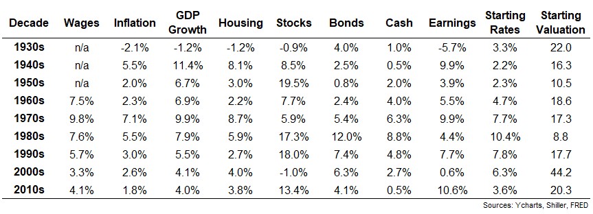
I also looked at economic growth, returns for housing, stocks, bonds and cash, earnings growth, interest rate levels and stock market valuations.
You can see the 1970s were a period with high growth in earnings, GDP and wages but inflation was out of control so that growth was a mirage. Then you had a period like the 1990s where the economy did well, wages were up, inflation was average and stocks went nuts. Wages actually outpaced inflation by a wide amount in the 2010s but those gains weren’t equally distributed.
While inflation and wages do have some sort of relationship, it’s not as clear-cut as you would think.
Once you begin looking at all of these variables you realize there are relationships here but caveats abound. There is no such thing as a “normal” market or economic environment. Each period is unique in its own way.
Markets and economies are constantly changing as are the inputs that make them up.
For example, Michael Mauboussin wrote an excellent research piece this month about the relationship between valuations and accounting methods that bears this out. Look at this chart of the percentage of companies in the U.S. stock market with negative earnings:
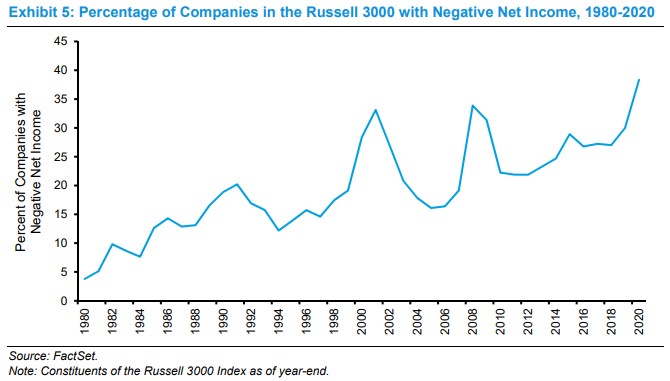
It’s gone from under 5% in 1980 to around 40% today. This has to be alarming for investors, no? Almost half the companies in the U.S. stock market lose money each year?!
Technically yes but it’s not as bad as it appears. This says more about the composition of the stock market and accounting methodologies than anything. Mauboussin explains:
Intangible investment has been in a steady uptrend, with a brief interruption during the financial crisis, and passed maintenance spending in 2000. To put this figure in context, investments in intangible assets were roughly $1.8 trillion in 2020, more than double the $800 billion in capital expenditures. These data put the lie to the assertion that companies are investing less than they used to. This work shows clearly that investments in intangible assets are rising relative to those in tangible assets.
As a result, the failure to measure the magnitude and return on intangible investments is a large and growing problem.
Basically, these intangibles are showing up as an expense on the income statement when really they should show up as an asset on the balance sheet. Here’s the kicker:
Investors generate excess returns when they buy the shares of companies prior to a revision in expectations about future cash flows. A key determinant of cash flows is a company’s ability to allocate capital to investments that create value. The current principles of accounting do a poor job of separating investments and expenses, creating a veil that obscures the magnitude and return on investment.
If you were to simply take these numbers at face value the stock market looks like a house of cards. But if you dig a little deeper you understand how much different markets are today than they were in the past.
Bill Miller touched on this in a recent letter to his clients:
Some stock market models are flashing yellow, indicating caution at these levels. I am reminded of the aphorism attributed to the eminent statistician George Box, who said “all models are wrong, but some are useful.”
The models that show the market is overvalued are not wrong with respect to their parameters, but they are not useful, in my opinion, because their parameters do not capture the complexity of what drives markets. Market or economic forecasts are forecasts not of variables ordered in particular ways, but forecasts of behavior.
This is not to say the stock market can’t or won’t fall from here. It certainly can and will at some point. But if you’re using economic or market relationships from the past with no context about how things have changed with the market and economy, your models are basically useless.
Michael and I discussed Mauboussin, Miller, Dogecoin and more on this week’s Animal Spirits video:
Subscribe to The Compound channel for more of these videos.
Further Reading:
10 Things You Can’t Learn From a Backtest
Now here’s what I’ve been reading lately:
- How people get rich now (Paul Graham)
- How to buy happiness (The Atlantic)
- A second chance at a lower mortgage rate (Abnormal Returns)
- Keeping your cool when markets are sizzling (WSJ)
- Welcome to the YOLO economy (NY Times)
- Why people go mad in groups (Next Big Idea Club)
- Why new retirees tend to underspend during retirement (Financial Bodyguard)
1I checked – the median home price in 1950 was $7,400. Median household income was around $3,000.