I came across two new tools for looking at the historical inflation of the various components that make up the average.
Jesse Livermore created a tool at Philosophical Economics that allows you to compare 300 different goods and services to the inflation rate over time.
For instance, this is the price of eggs versus the personal expenditures price index since 1959:
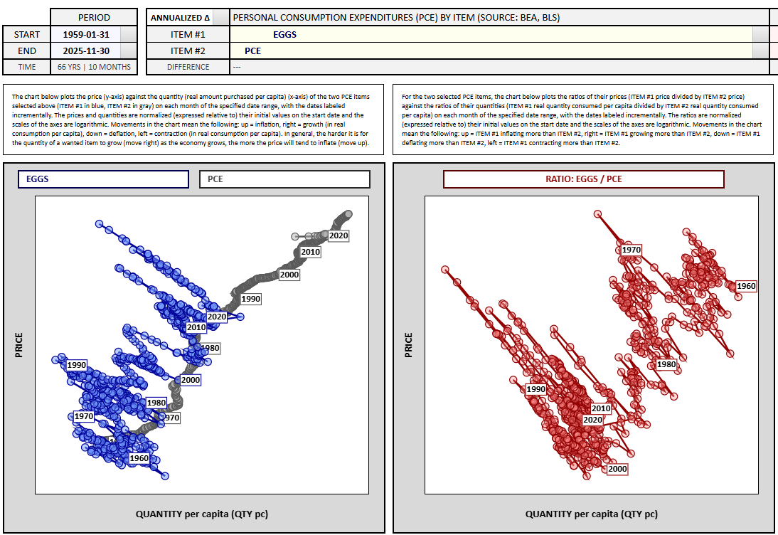
Surprisingly, the long run price has grown at a lower rate than PCE (2.4% vs. 3.2%). But look at all of the price shocks on the charts when there are supply problems with eggs. It shoots higher but then quickly falls back to or below trend.1
Here’s housing over the long run:
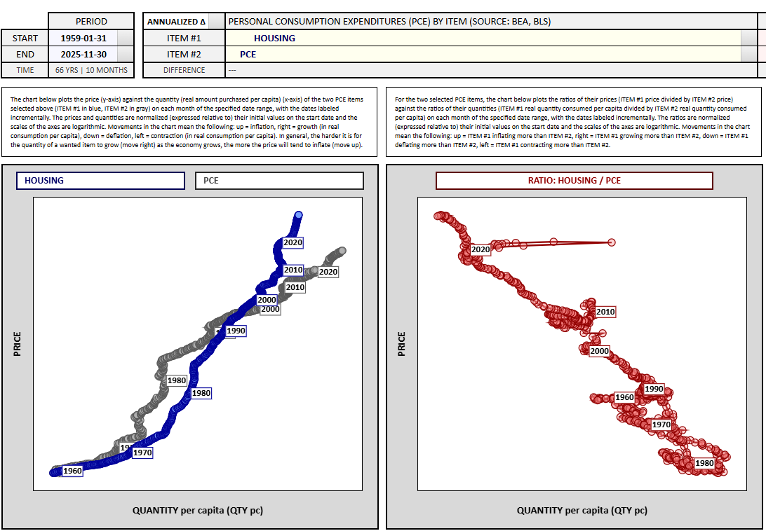
The long-term growth rate for housing is slightly above inflation — 3.78% vs. 3.24% since 1959.
However, there is a caveat here. The calculation for housing in the inflation rate considers both rent inflation and imputed rent (how much homeowners think they would pay to rent their house) so it doesn’t necessarily measure the cost of buying a home.
What Should I Spend has an inflation calculator that allows you to compare the price of goods back in 1970 to the price today along with what the price would look like had it tracked the inflation rate.
For example, here’s bacon: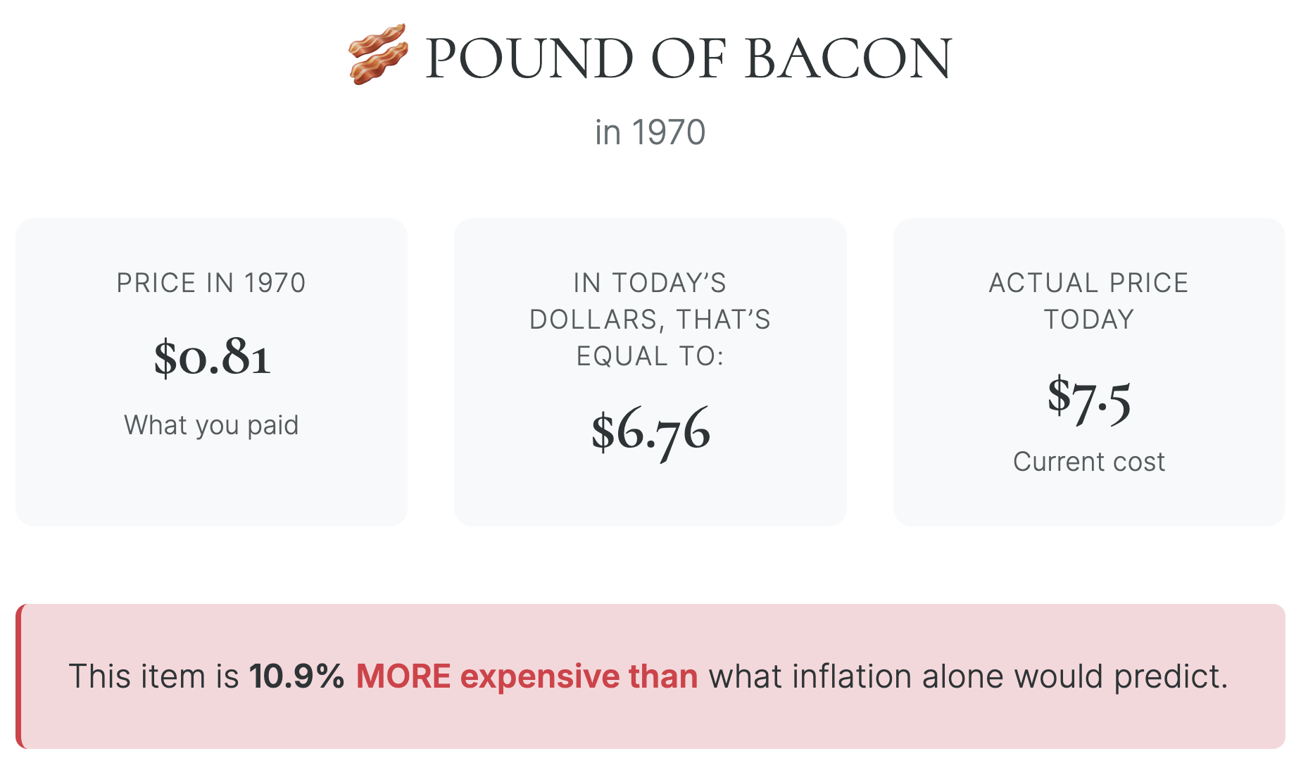
It cost 81 cents for a pound of bacon in 1970. Had that price simply tracked the inflation rate it would be $6.76 today. The average cost is actually $7.50, meaning the price grew faster than inflation.
The average gallon of milk is the opposite: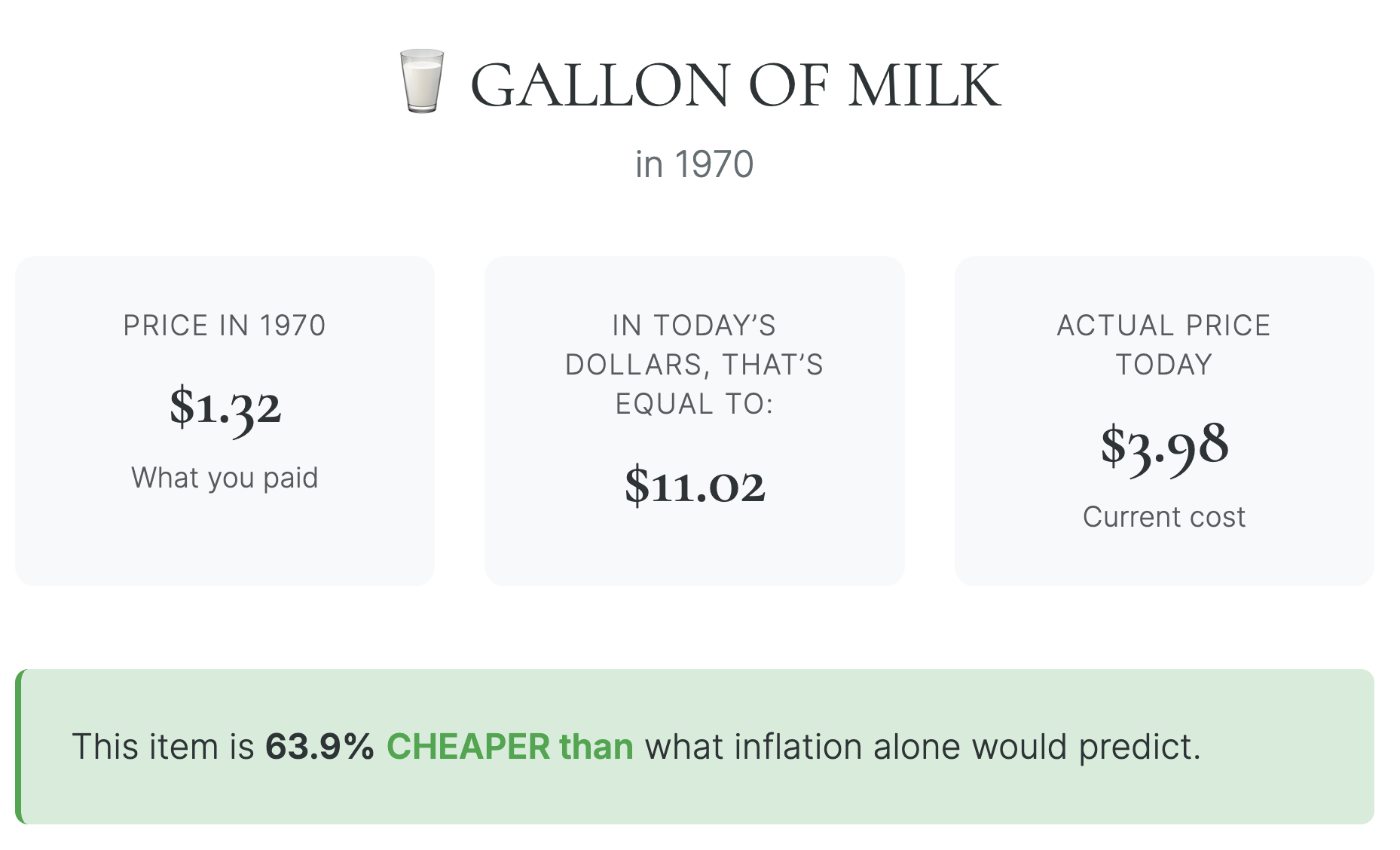
Milk prices have grown much slower than overall inflation.
Now look at the cost to buy a median home:
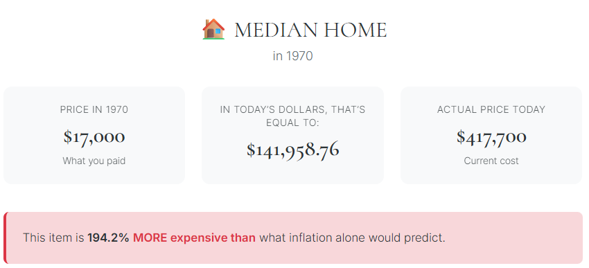
This one makes intuitive sense.
Housing is a lot more expensive today than it was in the past, even when you account for inflation.
However, there is some context necessary here. Back in the day, when houses were more affordable, they also had far fewer amenities.
No open concept floor plans. No quartz countertops. No stainless steel appliances or 3-car garages or mud rooms. Most houses lacked some of the basics we now take for granted too.
I’ve written about this before but it’s worth revisiting:
The U.S. Census puts out an annual report on characteristics of new housing. Check out the differences between now and the early-1970s:
-
- In 1973, 49% of homes had no air conditioning. Now just 7% of houses have no AC.
- In 1973, 40% of homes had 1.5 bathrooms or fewer. Today just 4% have fewer than 1.5 bathrooms.
- In 1973, 64% of houses had 3 bedrooms while 23% had 4 bedrooms or more. Now 42% of houses have 3 bedrooms while 47% come with 4 bedrooms or more.
- In 1973, the median house had 1,525 square feet of space. Today it’s closer to 2,500 square feet.
- In 1973, the average size of a U.S. household had 3 people living under one roof. That average is down to 2.5 residents per house.
Houses were smaller back then. More people under one roof had to share bathrooms and bedrooms. Homes are bigger and nicer now and the higher prices reflect the higher quality. That doesn’t explain the entire price surge but it’s part of it.
The land is also getting more expensive.
Look, I’m not here to give you a contrarian take on housing costs. They are definitely high.
But this example is one of the reasons calculating the long-term rate of inflation can be challenging (and why no one really believes the reported data).
Economists try to include hedonic adjustments for quality improvements but it’s an inexact science.
One of the downsides of having a higher standard of living is that it costs more. Higher housing costs also have a societal cost. Everyone needs a roof over their head and lots of young people want to buy a home right now but can’t afford it.
It would be nice if we could find reasonable ways to incentivize more building of bigger, nicer homes today.
Michael and I talked about housing, inflation and more on this week’s Animal Spirits video:
Subscribe to The Compound so you never miss an episode.
Further Reading:
How to Fix the Housing Market
Now here’s what I’ve been reading lately:
- Who is on the other side? (Michael Mauboussin)
- Postcards from the edge of the world (Garrett Baldwin)
- The hardest part about investing (Chart Kid Matt)
- Flying under the radar (Darius Foroux)
- A storm is coming (Downtown Josh Brown)
Books:
1These charts might be a little hard to read, so click on the link or just right-click the graph and hit open image in new tab.