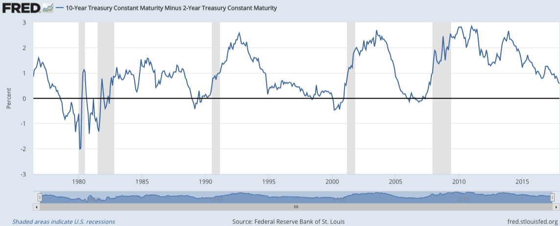
There are no can’t-miss-works-every-time signals in the stock market or the economy. It’s never quite that easy. But inverted yield curves have been a fairly reliable indicator in the past in terms of danger ahead for stocks and the economy. I did a deep dive on what this could mean based on historical observations in a piece for Bloomberg.
*******
Predicting when the next recession will begin is no easy task because the economy doesn’t operate on a set schedule. But there is one market relationship that’s been a reliable indicator over that past 40 years or so — the spread between the two- and the 10-year Treasury yields.
The chart below shows that every recession since the mid-1970s (the shaded regions) has followed an inverted yield curve when the two-year note yields more than the 10-year:

The spread has been rapidly closing in recent years and is fast approaching another inversion. Since September alone, the two-year yield has gone from 1.26 percent to 1.85 percent. In that same time, the 10-year yield has gone from 2.05 percent to 2.37 percent. This means the yield curve is getting “flatter” as long-term rates are rising much slower than short-term rates.
This matters because bond yields are typically used to gauge the health of the economy. Wider spreads between short-term and long-term bonds lead to an upward sloping yield curve, which can indicate healthy economic prospects — most likely faster growth and inflation in the future. Narrower spreads lead to a flatter or even negatively sloped yield curve, which can indicate poor economic prospects — most likely slower growth and inflation.
Experts predict that the two- to 10-year spread could invert as early as 2018, which could be accelerated by further rate hikes from the Fed. Nothing works always and forever in the markets, but this is a situation economic watchers should pay attention to — just not right away if we use history as a guide. Here are the start dates for the five previous inverted yield curves along with the beginning of the ensuing recessions:

There has been a substantial lag from the time of the inversion until the start of the recession in each of these instances. The average number of months was 17, meaning it took about a year and a half for the economic slowdown to hit after the inverted yield curve. We can also look at the stock market’s performance in this lag period to see how the S&P 500 has performed after the yield curve inverted but before the start of the next recession:

The average return in these periods was a gain of more than 15 percent; there was just one downturn, which occurred after the dot-com bust in the early 2000s. Although the stock market doesn’t need to see a recession for a large correction, it’s a safe bet that an economic contraction will lead to a drawdown in stocks.
The old joke is that the stock market has predicted nine of the last five recessions, but stocks have actually gone into correction, and even bear market territory, far more quickly than the economy has sunk into a recession following an inverted yield curve. This table shows that every one of the five times since the mid-1970s that long rates have fallen below short rates, the S&P 500 has experienced a double-digit drawdown:

The timing of these market corrections varies widely. In late 1980 and early 2000, the inverted yield curve signaled a quickly approaching stock market peak. In the other three instances, it was almost two years until stocks broke down.
These types of relationships are never written in stone, but you can see why investors and economists alike are wary of the possibility of an inverted yield curve. If history is any indication, the two- to 10-year spread is worth watching for both an economic and stock market downturn.
Originally published on Bloomberg View in 2017. Reprinted with permission. The opinions expressed are those of the author.
