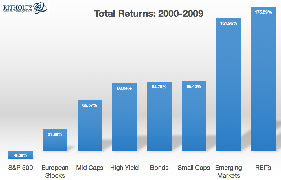
A decent bull market sandwiched between two of the most brutal bear markets in history produced one of the worst 10 year stretches ever in the S&P 500* in the first decade of the 21st century.
Many investors labeled the 2000s as the lost decade for stocks. Considering the S&P lost around 1% a year in this time, it’s hard to argue with that classification.
However, this is just one group of stocks. Other markets, asset classes and regions of the world did much better during this period:

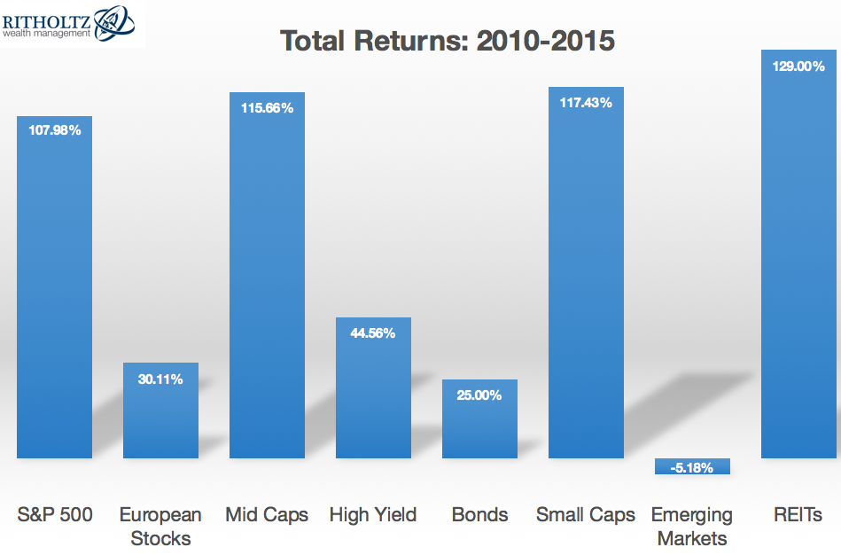
Nothing lasts forever in the markets and the follow-up to the lost decade has seen some massive mean reversion in these standings, most notably between the S&P 500 and Emerging Markets:

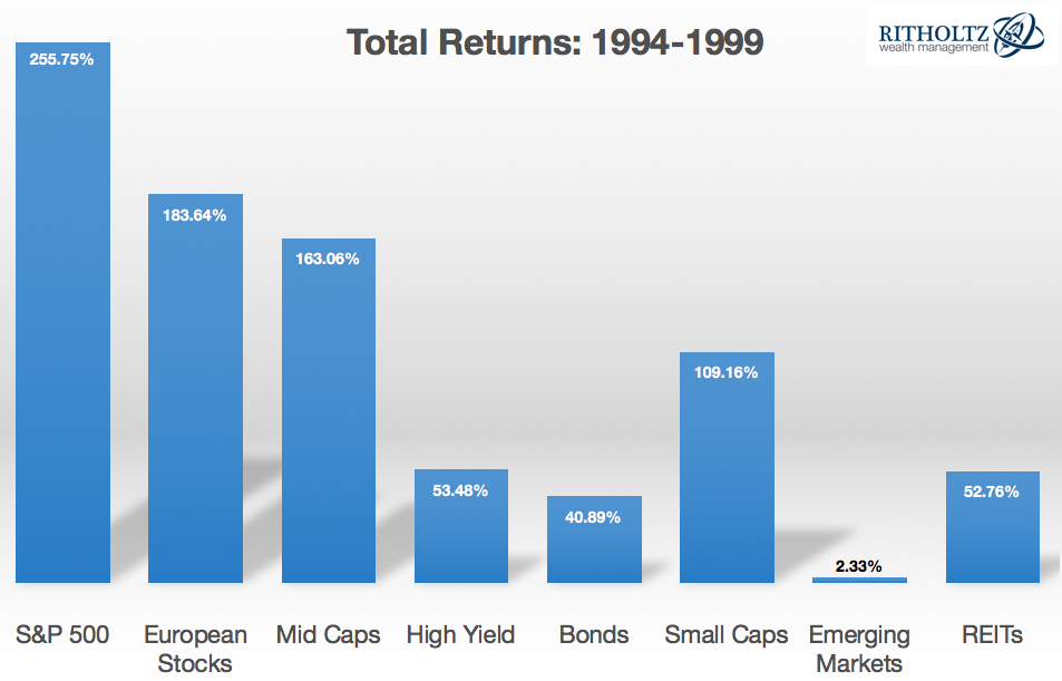
To bring things full circle, here are the returns for the six-year period preceding the lost decade:

The cycle of great performance-terrible performance-great performance in the S&P 500 is pretty striking in these numbers. Emerging markets are the exact opposite with a streak of terrible performance/great performance/terrible performance. Apparently un-correlated returns do still exist in a more globalized financial world.
A few more thoughts on these numbers because I always find the cyclical nature of asset returns to be fascinating:
- The S&P 500 and emerging market returns offer a clear example of mean reversion in action, but not all of these markets exhibited the same boom-bust cycle. REITs were the strongest performers during each of the past two periods (perhaps making them a candidate for future mean reversion?).
- Even during seemingly terrible decades such as the 2000s, we can still see certain markets perform well (EM, REITs and bonds). And even during seemingly amazing decades such as the 1990s, we can still see certain markets perform poorly (EM).
- The ranges between the best and worst performers in these cycles can be enormous, showcasing the volatile nature of these asset classes:

- The total returns for these various markets are all over the map. However, if you were to simply take the average of an equal weighted portfolio of these eight different markets you would get a total return stream that is much more stable for each time frame:

- Risk assets are unpredictable and yes, risky. Bonds can outperform stocks at times. Lost decades are going to happen in certain markets. Higher expected returns don’t always translate into actual higher returns in the real world because nothing lasts forever and trees don’t grow to the sky.
- Diversification isn’t just about spreading your bets and ensuring that you’re likely to participate in the best performing asset class or strategy; it’s about ensuring that you’re not overly exposed to the worst performer.
Further Reading:
When Diversification Works
*The worst 10 year return on the S&P 500 going back to 1927 was a loss of 5% a year in the aftermath of the Great Depression in the 1930s.
Data from Returns 2.0: S&P 500, MSCI European Index, Russell MidCap Index, S&P 600 Small Cap Index, Barclays High Yield, Barclays Aggregate, MSCI Emerging Markets and Dow Jones Wilshire REIT Index

Ben, wouldn’t this also imply that the more unique asset classes you have (and the more their risk characteristics are unique), the better your return/risk profile (assuming regular rebalancing)? My thought being that certain asset classes may be work really well together, but others not so much. If you have bonds, for example, having Hi Yield in addition perhaps doesn’t contribute much to your portfolio from a risk perspective (and maybe not much from a return perspective)?
I do think there is something to be said for a multi-asset class/strategy approach because you do get more investments that are out of step with one another. Just depends how complicated you want to make it and whether or not you have the discipline to regularly rebalance
Nice post – great graphics!
I’d be curious to know how the S&P did using all of your graphs from 1994-2015 against all of the other asset classes.
Good question. Annual returns in the order of these graphs (starting with the S&P):
9.1%, 7.3%, 10.6%, 6.6%, 5.5%, 10.2%, 4.3%, 10.8%
Ben, do you have a piece similar to this except with GDP figures versus market outcomes?
An older one here with some good research on this:
https://awealthofcommonsense.com/2013/03/stocks-and-the-economy-2/
Thanks! This is a good one to keep updating…
Ben, what is your proxy for small and mid caps? Or another form of same question: what ETF do you use for each when you use an ETF? Thanks.
I used indexes for these numbers. Russell Mid Cap Index and S&P Small Cap 600 Index.
Ben, I respectfully suggest that you are off the mark with this post. Mean reversion is the result of the human mind looking for patterns where they don’t necessarily exist. From 1926 through 2014, the S&P 500 rose 5% or more in a month 179 times. It fell the next month 59 times. That is a 67% frequency of positive returns, which is only slightly higher than the 62% frequency of positive monthly returns overall, and it certainly does not demonstrate mean reversion on the monthly scale. It simply shows that stocks do not need to mean revert after they go up nicely.
Mean reversion assumes past performance predicts the future. They assume economic, political and sentiment-related factors stop moving stocks, and that cyclical moves rule long term performance. Assumptions that mean reversion is real also leads to mistaken judgements about sector and country performance on year-long timescales. At the end of every year, publications and articles treat us to lists of the best and worst sectors, and there is a school of thought that says buying the prior year’s worst performer is a winning strategy. But if you look at the S&P sector numbers (breaking the S&P into nine sectors) since 2000, the worst sector has been the following year’s best sector just twice in the last 25 years. Sometimes the worst was worst twice in a row. Sometimes it was so-so the next year. On a country level, if you sample the 22 MSCI World Index countries with returns back to 1990, the worst performers have never beaten the pack the following year. They’ve repeated as worst twice and been in the bottom tier plenty of times.
Mean reversion is simply an interesting backward observation. It has nothing to do with causation, and has no predictive power. Believing otherwise can lead to terrible investing outcomes!
Mean reversion is simply the theory that above average performance will eventually move back towards the average and below average performance move up towards the average. The problem is that it doesn’t run on a set schedule.
Two thoughts:
1. A theory that offers no actionable boundary is rather useless as a theory. An analogy is my theory that there is a recession coming, which as long as I do not specify when, is guaranteed to be 100% correct, and totally unactionable from an investment viewpoint.
2. There is no law that states that means cannot change over time. For example the mean Dow value during the 1970’s bear market suddenly shifted upwards in the 1980s. And mean P/E ratios certainly change over time, as do stock mean dividend yields, and fund manager performance. Means change all the time, and often they increase or decrease for very prolonged periods, and occasionally permanently. Investment mean measures are not like gravity, they are not fixed by the universe, they are simply backward looking observations, and we all know that past performance does not predict future returns.
To treat mean reversion as anything more than a false belief can lead to poor investment decisions.
What is the mean reversion when central banks manipulate multiple markets in a currency war that has no economic value and which is not driven by CAPM?