Having a historical perspective on the markets is crucial to be able to understand the present and plan ahead for the future. Looking back on how the markets have performed in various economic, interest rate and investment cycles can give you a broader sense of how things generally function.
It’s not always an exact comparison, but using history as a guide can teach you about mean reversion, the fact that markets tend to move in cycles and the benefits of thinking long-term in a short-term world.
Unfortunately, sometimes market strategists can take the historical comparisons a little too far and make conclusions that don’t necessarily tell the whole story.
Tom DeMark is a stock market analyst who uses technical indicators or price patterns to make market calls. He’s made some pretty good market timing calls over the years, but he’s also been off the mark on numerous occasions as well. That’s how market timing works. Sometimes right, sometimes wrong, never consistent.
His latest call is that the Dow Jones Industrial Average since May of 2012 is starting to look very similar to the run up to the great stock market crash of 1929. Here’s a chart that shows the parallels:
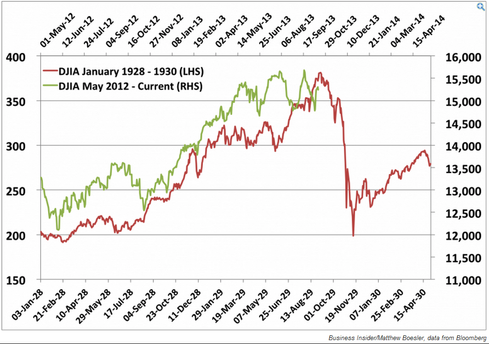
At first glance, the two markets do look like they are moving in lockstep with one another. And it would appear that we are closing in on the 1929 highs that led to the crash.
But there’s a problem with this chart. The scales are completely different. Just look at the differences between the values on the left and right side of the graph. The magnitude is not nearly the same even though the lines look eerily similar.
Let me explain. The red line that shows the 1929 stock market crash goes from a Dow level of roughly 380 down to just under 200. This would equate to a loss of nearly 50% in the market. Not fun.
If the current market was to stay on the same path as 1929, the Dow would fall from around 15,400 to 12,000. That leaves the market with a loss of just over 20%. That’s no fun, but a 20% loss happens, on average, around every 4 years.
I think I’d take a 20% loss over a 50% crash (if that’s where we’re headed).
Over the past 85 years or so, 50% losses have come about every 21 years on average. That doesn’t mean it can’t happen again, because we have seen two such drops in the market in the past 15 years alone.
You just have to put things in perspective when dealing with information like this. With such a long history of ups and downs in the markets, it’s easy to look back and find patterns that look similar over many cycles. Just be aware that not all of these graphs and charts tell the same story.
You can take almost any bull market or any bear market from the past 100 years that look similar, slap them on the same graph and voila, you have a bullish or bearish scenario based on a bunch of squiggly lines. The technical term for this in nerdspeak is data mining.
That’s why it’s so important to look for multiple opinions and datasets when making investment decisions. There will always be one piece of research that confirms your strongly held views if you look hard enough.
I’m not here to make a call one way or another on his prediction of a market crash. It could happen or we could continue to march higher. Historical averages in the markets are rarely easy to estimate. Most times there is a wide variation around the averages in the short to intermediate term.
I’m just here to make sure you don’t misinterpret information and don’t get misled into believing that the future has to be exactly like the past.
Source:
Tom Demark: The ominous 1929-parallel is warning of a market crash (Business Insider)