“Averages and relationships and trends and graphs are not always what they seem. There may be more in them than meets the eye, and there may be a good deal less.” – Darrell Huff
There was a study a number of years ago that split a number of people into two separate groups. One was asked if they thought it was possible to save 20% of their income. About 50% of them said yes. The other group was asked if they could live on 80% of their income (thus saving the remaining 20%). In this group, nearly 80% said yes.
It’s the same question, just posed in a different way. How things are framed can play a huge role in how we interpret certain statistics. This is just one of the many ways in which numbers can fool us.
With more information than ever available at our fingertips on seemingly anything we want these days you have to be a smart consumer of information and statistics to look beyond what you’re seeing at face value. Darrell Huff explains:
The secret language of statistics, so appealing in a fact-minded culture, is employed to sensationalize, inflate, confuse, and oversimplify. Statistical methods and statistical terms are necessary in reporting the mass data of social and economic trends, business conditions, “opinion” polls, the census. But without writers who use the words with honesty and understanding and readers who know what they mean, the result can only be semantic nonsense.
This passage reads like it could have been written yesterday, but this actually comes from Huff’s excellent book, How to Lie With Statistics, which was published in the mid-1950s. It’s roughly 150 pages long, so it’s a quick read but it’s full of useful ideas and context about how people and businesses try to trick you through the use of statistics.
The point is that even statistics require context and critical thinking.
It’s probably easier than ever today to use numbers, data and probabilities to confuse people as we now tend to consume information through headlines, social media posts and opinion pieces instead of looking at the actual data to gain a better understanding.
Finance is ripe for statistical misrepresentations and lies because we’ve never had more market or economic data available for free. There are so many graphs, tables, charts and numbers that come out on a daily basis that you’re bound to be confused eventually.
I’ve been seeing one such statistic quite often lately that I thought could use another look. Kevin Warsh, a former member of the Federal Reserve Board, writing in the Wall Street Journal, shared the following last week:
A simple, troubling fact: From the beginning of 2008 to the present, more than half of the increase in the value of the S&P 500 occurred on the day of Federal Open Market Committee decisions.
I’ve seen this statistic many times in the past couple of years. The standard conclusion that people would like you to draw from this is that the Fed is the only thing propping up the stock market. FOMC decisions — on interest rates, economic outlooks, stimulus or monetary policy — are obviously the only game in town. Take away all of those Fed days and returns don’t look so great.
And at face value this comment is correct. I ran the numbers myself — since the start of 2008 the S&P 500 is up just over 78% including dividends. The FOMC meets 8 times a year to announce their decisions to raise, lower or do nothing with short-term interest rates and other monetary tools at their disposal. Using just those 8 days every year since 2008, the S&P 500 is up over 38% or roughly half of the total return.
So this proves that the Fed is the only game in town, right?
Well, not really. 2008 is a rather arbitrary starting point so I did the same exercise starting in 2009, 2010 and so on through 2013:
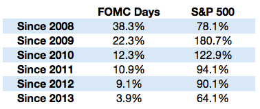
Using just 2008 as a starting point makes it look like all of the gains since then are Fed-induced. But look what happens when you change the starting date — the relationship doesn’t look quite as clear anymore. There were still gains on those days but it’s not like they were all the gains or even a huge proportion of the total.
Stocks were highly volatile in 2008. In fact, stocks were either up or down 1% or more in almost 53% of all trading days. And stocks finished the year down 37% or so. This means that any up days in that time would make a massive difference relative to the total return in that year.
I’m not trying to suggest the Fed has had no impact on the markets. They obviously have. The S&P has only been down roughly 20% of all FOMC days versus a 46% down rate in all other days since 2008. Things have definitely been better in the markets on FOMC days as market participants pay more attention to central banking actions than ever before.
But I don’t generally trust people who place all of the credit or all of the blame on a single variable when we’re working with complex adaptive systems. It’s never that easy.
Many Fed-haters want you to believe that this entire market rally has been one big manipulation. Huff has another quote in the book that comes to mind on this: “If you can’t prove what you want to prove, demonstrate something else and pretend that they are the same thing.” There’s been a lot of that going on in the world of finance in recent years.
Statistics can be very useful when forming an opinion. But statistics — and more likely the author of those statistics — can lie to you as well.
Source:
How to Lie With Statistics
Further Reading:
How Framing Affects Investment Decisions & Outcomes
My Favorite Non-Investing Books About Investing