I enjoy reading and writing but I’m a visual learner.
I like charts.
Here are some crazy charts I’ve been thinking about lately.
Torsten Slok shared a chart of gas prices going back to 2004:
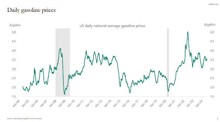
The average price over this 20+ year timeframe is around $3/gallon which isn’t too far from current levels.
And $3.50/gallon today is not the same thing as $3.50/gallon in 2008. Just look at the inflation-adjusted price of oil:
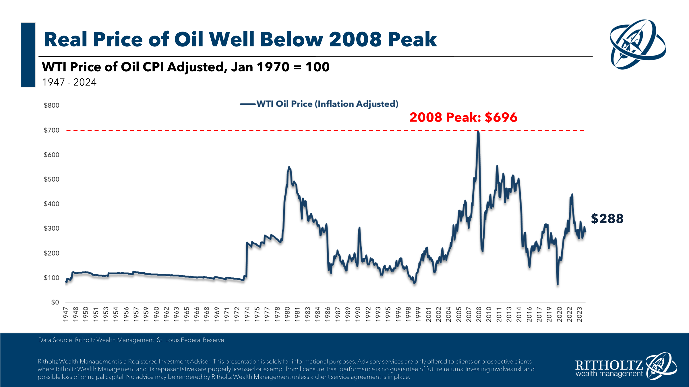
On a real basis, energy prices have gotten a lot cheaper over the past 15 years or so.
You can get a better sense of this decline by looking at the amount people spend on energy as a percentage of overall personal consumption:
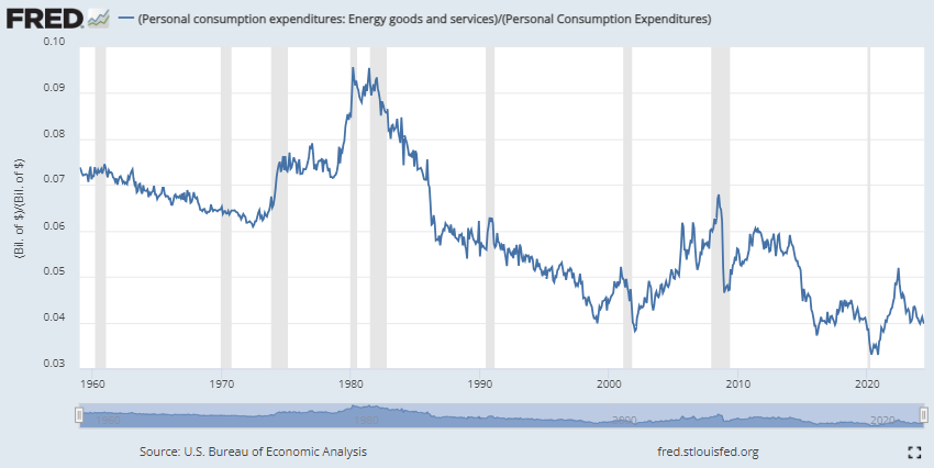
Outside of the artificially low prices during the pandemic, consumers are spending a lower amount of their budget on energy than just about any time going back to the 1960s.
The high point on this chart was in the early-1980s when inflation finally peaked. The early-1980s was also the inflation-adjusted peak for gold prices:
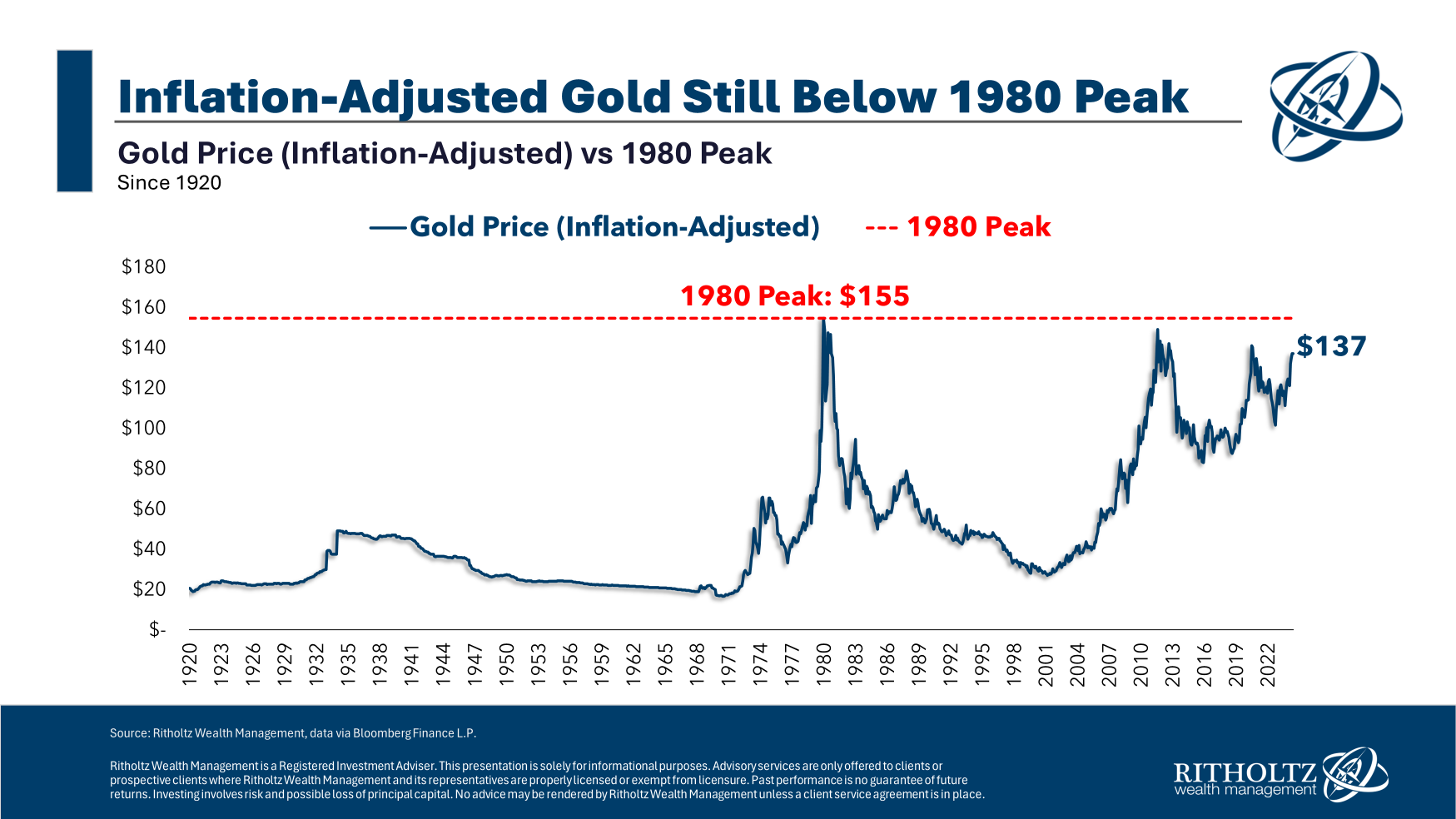
This is one of those hard-to-believe-but-true market stats. Of course, I’m also having fun with numbers because of the insane run-up in the price of gold during the 1970s.
Gold has actually outperformed stocks by a wide margin this century:
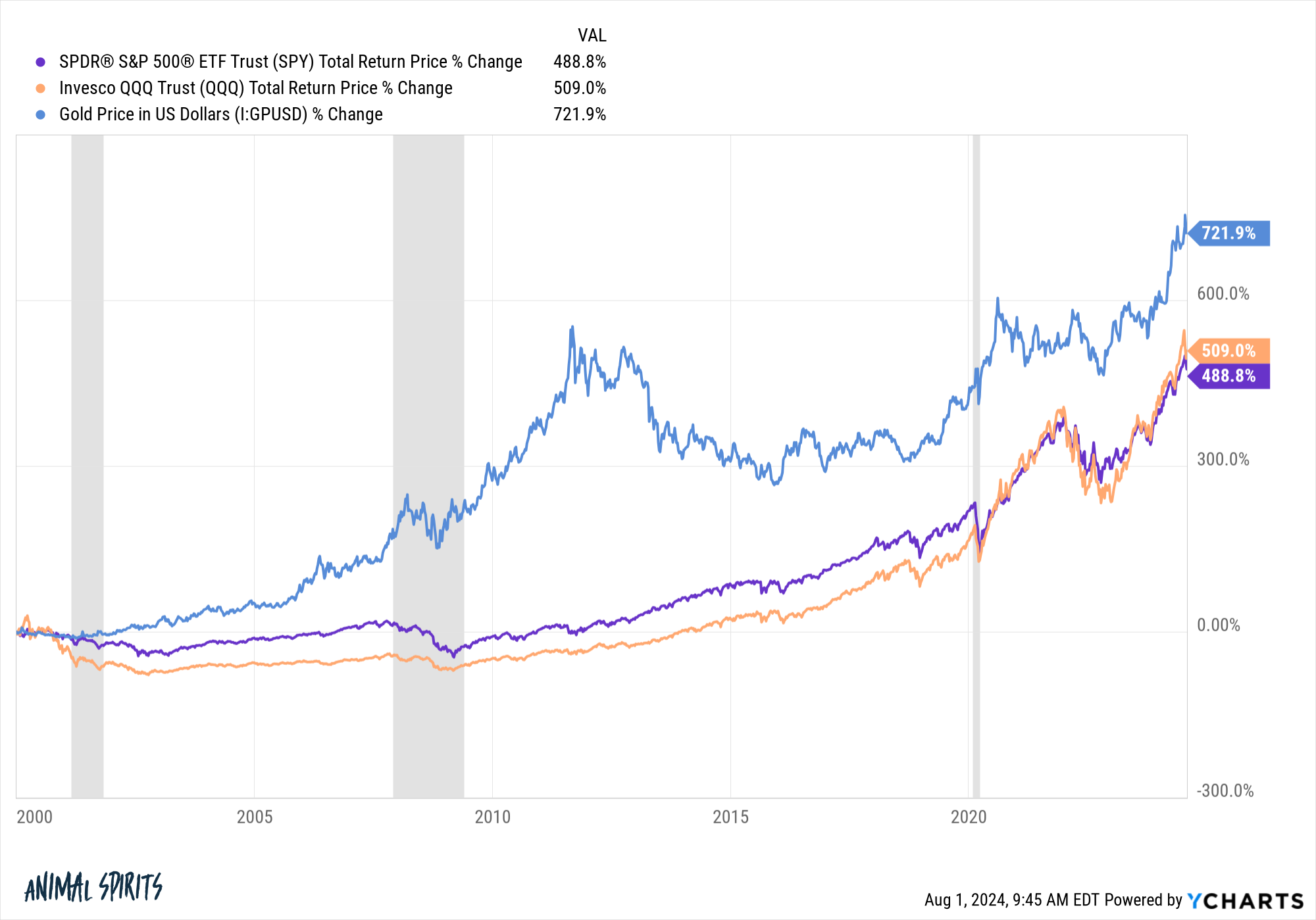
This is fun with numbers too since the start of this one coincides with the peak of the dot-com bubble, but I wanted to show both sides here.
As always, you can win any argument about the markets you want if you change your start or end dates.
Here’s a trend that doesn’t require any fun with numbers:
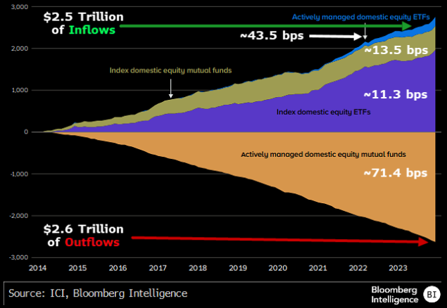
Bloomberg’s James Seyffart shows that, over the past 10 years or so, there have been trillions of dollars going from actively managed mutual funds into passively managed index funds and ETFs.
Just look at the average fees for each category. This is a huge win for investors!
With more baby boomer capital going to financial advisors and getting rolled over from 401k plans, I wouldn’t expect this train to slow down any time soon.
The Fed decided to hold rates steady this week. The markets did not like that decision because the labor market, wages and economic growth are all slowing.
Here’s why I didn’t like it:
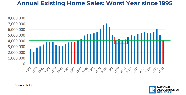
Higher mortgage rates have strangled housing activity this year. According to the NAR, we’re looking at the worst year for existing home sales since 1995.
Here’s the kicker — there are 70 million more people in the country now! There should be way more housing activity going on.
Plus you have all of these life events happening: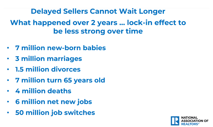
Housing market activity accounts for roughly ~20% of economic activity in the United States.1
Luckily, mortgage rates are falling as bond yields drop but the Fed could have given another nudge in the right direction.
Plus there is the fact that spreads between mortgage rates and Treasuries are still well above the long-term averages:
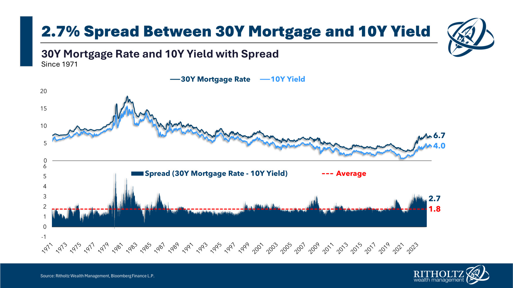
There are some wonky reasons for this but the Fed had a hand in spreads blowing out when they purchased a bunch of mortgage-backed securities during the pandemic and messed with this market.
They should be buying mortgage bonds every time spreads blow out like this.
A functioning housing market would be good for the economy. Lower mortgage rates would help.
Michael and I talked crazy charts and much more on this week’s Animal Spirits video:
Subscribe to The Compound so you never miss an episode.
Further Reading:
The U.S. Real Estate Market in Charts
Now here’s what I’ve been reading lately:
- Every 7 years (A Teachable Moment)
- Breaking up a fight (Echo Beach)
- Nike: An epic saga of value destruction (LinkedIn)
- A primer on charitable giving (Belle Curve)
- Waiting to buy the dip (Oblivious Investor)
- Garden State 20 years later (THR)
Books:
1This includes all of the ancillary spending that comes with housing (construction, furniture, moving, loan originations, etc.).