A reader asks:
Why we are where we are with total market cap over GDP (the Buffett Indicator) and let me know what this could mean going forward?
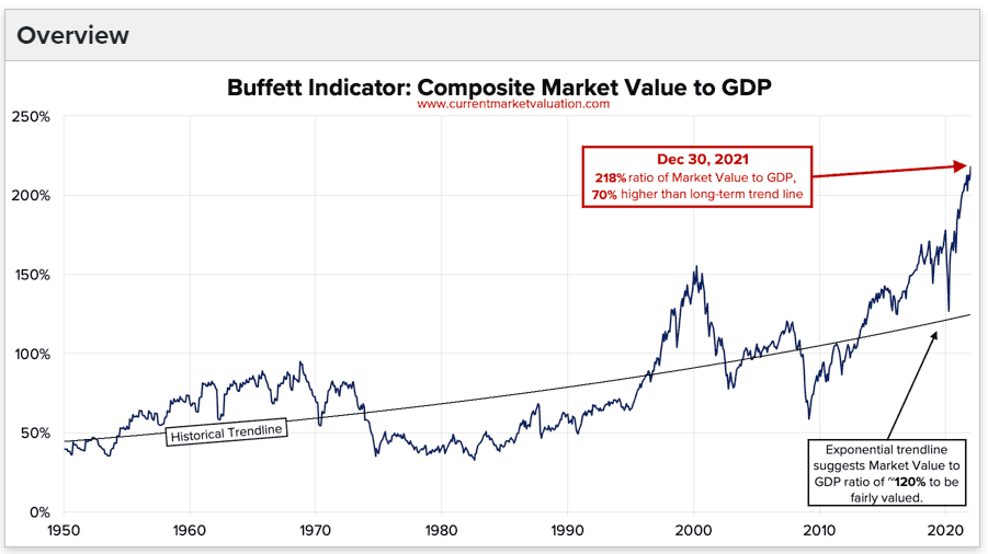
The Buffett indicator was born in a 2001 Fortune interview between the Oracle of Omaha and Carol Loomis. It simply compares the market capitalization of the U.S. stock market to U.S. GDP.
Here’s what Buffett had to say about it at the time:
The ratio has certain limitations in telling you what you need to know. Still, it is probably the best single measure of where valuations stand at any given moment. And as you can see, nearly two years ago the ratio rose to an unprecedented level. That should have been a very strong warning signal.
That very strong warning signal was when market cap to GDP hit 150% in late-1999/early-2000.
If that ratio was a strong warning signal then, the current valuation levels just said hold my Cherry Coke:

By today’s measure, the stock market is the most overvalued it has ever been. It makes the late-1990s look calm by comparison.
So this is the biggest stock market bubble in history right?
I guess it’s possible.
It’s also possible things change and one number doesn’t tell you everything you need to know about what’s going on in the stock market.
At the Berkshire Hathaway annual meeting in 2017, Buffett fielded a question about the valuation metric that now bears his name along with the CAPE ratio. This was his response:
“Every number has some degree of meaning,” Buffett said. “It means more sometimes than others. … And both of the things that you mentioned get bandied around a lot. It’s not that they’re unimportant. … They can be very important. Sometimes they can be almost totally unimportant. It’s just not quite as simple as having one or two formulas and then saying the market is undervalued or overvalued.”
One of the main reasons Buffett changed his tune was the level of interest rates.
From 1995-1999 when the dot-com bubble blasted off into outer space, the 10 year treasury averaged 6.1%. Since 2019, the 10 year has an average yield of just 1.2%. All else equal, a lower discount rate should mean higher values for financial assets.
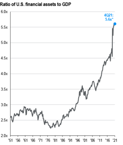
Regardless of the effectiveness of this valuation measure, the clear trend in financial assets is higher when compared to the economy over the past 3-4 decades.
This chart from the JP Morgan Guide to the Markets that compares all U.S. financial assets to GDP makes this even clearer:

How is this even possible?
First of all, we have the stock vs. flow thing to clear up.
Stock is measured at one specific point in time (that’s the stock market). Flow is measured over a specific time period (that’s the economy). Each year the economy is producing trillions of dollars in value while the stock market is a cumulative amount.
So we’re comparing apples to oranges in some sense.
We’re also just wealthier as a nation but wealthy in different ways. More wealth was tied up in private businesses in the 1970s and 1980s. Now corporations are more ubiquitous. You see Starbucks, Target or Walmart in almost every city now. Many of them would have been local mom-and-pop stores in the past.
And think about how enormous companies like Apple, Amazon, Microsoft and Google are. These companies are basically their own economies now and they’re global in nature.
Globalization is another trend that has changed the equation here. The Buffett indicator compares the U.S. stock market capitalization to the U.S. economy. But corporations now get a big chunk of business from overseas.
According to my friends at Calcbench, S&P 500 companies now get roughly 40% of their revenues from countries outside of the United States. Apple gets 60% of its revenue from international sources. Amazon is more than 40%. For Google, it’s more than half.
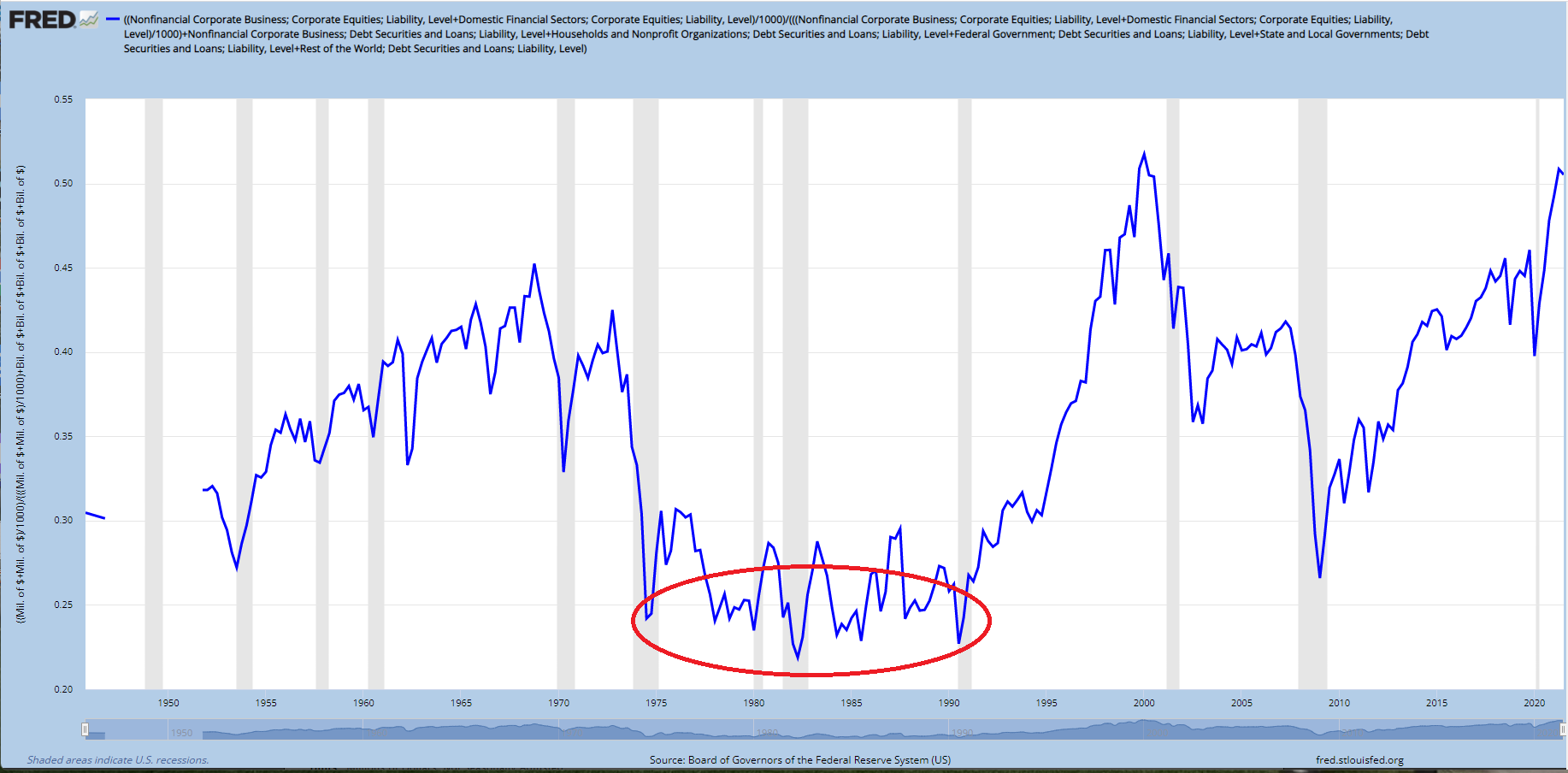
Plus think about how much easier it is to access financial markets. Just look at the average household allocation to equities over time:

Throughout the 1970s and 1980s, households had just 25% or so of their assets allocated to stocks. This low allocation came about from a number of factors — much higher interest rates (and inflation), terrible market returns in the 70s and a lack of useful retirement investment options.
In 1978 Ted Benna accidentally created the 401(k) plan. Now people put a percentage of their paycheck into their workplace retirement plan every time they get paid. This simply didn’t exist in the past.
And for the past 10 years or so targetdate funds have been the default investment choice at most defined contribution retirement plans. These funds now have around $2 trillion in assets and growing.
It’s easier to invest. It’s cheaper to invest. We have better technology, lower fees and lower minimums.
Therefore it’s no surprise financial assets have grown at a faster clip than the economy.
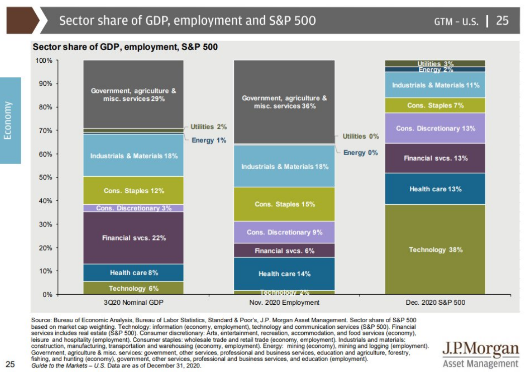
Plus there’s the simple fact that the stock market is not the economy:

Technology corporations make up a much large portion of the S&P 500 than the U.S. economy. Government spending makes up a much large portion of the U.S. economy than the U.S. stock market (please, no Fed jokes).
Are stocks at the higher end of almost every valuation metric imaginable?
Most likely.
Are things as crazy as they were in 1999?
In some cases yes but overall I don’t think so.
Does it make sense to place context around historical stock market averages and valuations?
Yes, yes it does.
I talked about this question on this week’s Portfolio Rescue:
With some help from my colleague Blair duQuesnay, we also answered questions about buying or leasing a car, when to reach out to a financial advisor, and the pros and cons of taking out a 401(k) loan.
