Valuation in the stock market is an inexact science.
Robert Shiller recently added a new wrinkle to his treasure trove of long-term stock and bond market data by including this chart:
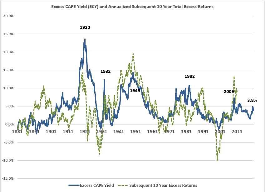
It might be a little confusing so allow me to explain.
The excess CAPE yield (blue line) is simply the CAPE ratio (stock market valuations) less the 10 year treasury yield. So it shows how much higher stock market earnings yields are than government bond yields.
The dotted green line shows the subsequent 10 year returns from those excess CAPE yields but those returns are the after-inflation and the excess part is real stock performance less the after-inflation returns of bonds.
So this is basically showing how the difference between starting stock market and bond market yields along with the corresponding over- or underperformance of stocks to bonds over the next 10 years on a real basis.
Without being a statistician and calculating the correlation between this data series, you can plainly see by eyeballing the chart that there is some sort of relationship between starting stock market yields and the subsequent performance of stocks relative to bonds.1
But you can also plainly see a number of instances where the forward returns from those starting yields drifted dramatically higher or lower than the starting place.
This is why valuations can be helpful for setting expectations with the understanding that the range of outcomes around your baseline has to be fairly wide.
If we could precisely predict the forward 10 year returns for the stock market there would be no risk when investing in stocks.
And if there was no risk when investing in stocks there would be no excess return over bonds.
Now that we have that disclaimer about valuations out of the way, take a look at Shiller’s updated CAPE ratio chart:
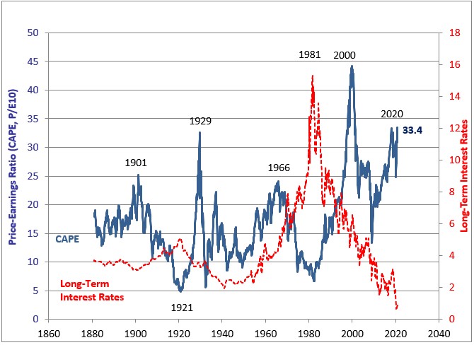
We’ll be entering 2021 with the second-highest CAPE level ever for a cycle.
The highest CAPE ratio of all-time came during the dot-com bubble of the late-1990s when it topped out at 44.2x.2
There are some similarities between the current cycle and the late-1990s dot-com bubble but some stark differences as well. While we are seeing an IPO/tech boom just like the 1990s, this time the companies actually have business plans.
Don’t get me wrong, some of the companies are surely being bid up higher than they should be and expectations are likely getting out of whack with how the future will unfold. But today’s tech companies are far more mature when they come public than the pieces of junk that were being bid up in 1999.
Plus, interest rates were much higher in the 1990s. If you look at that CAPE chart from Shiller you can see bond yields are included as well. The 10 year treasury yield finished 1999 at 6.3% which is right around the peak of that bubble.
Can you imagine earning a 6%+ yield on a default-free bond right now? Yield-starved investors would kill for that kind of income.
This is also a good reminder that interest rates aren’t the be-all, end-all for determining investor risk appetite. Yields were plenty high in the 1990s and investors still created the biggest bubble in our stock market’s history.
Shiller himself recently discussed the fact that stock valuations can and should be higher than usual because rates are so low right now. Here he discusses the new chart I shared above:
Thus, the level of interest rates is an increasingly important element to consider when valuing equities. To capture these effects and compare investments in stocks versus bonds, we developed the ECY, which considers both equity valuation and interest-rate levels. To calculate the ECY, we simply invert the CAPE ratio to get a yield and then subtract the 10-year real interest rate.
This measure is somewhat like the equity market premium and is a useful way to consider the interplay of long-term valuations and interest rates.
A higher measure indicates that equities are more attractive. The ECY in the U.S., for example, is 4%, derived from a CAPE yield of 3% and then subtracting a 10-year real interest rate of -1.0% (adjusted using the preceding 10 years’ average inflation rate of 2%).
We looked back in time for our five world regions—up to 40 years, where the data would allow—and found some striking results. The ECY is close to its highs across all regions and is at all-time highs for both the U.K. and Japan. The ECY for the U.K. is almost 10%, and around 6% for Europe and Japan. Our data for China do not go back as far, though China’s ECY is somewhat elevated, at about 5%.
This indicates that, world-wide, equities are highly attractive relative to bonds right now.
The majority of government bond debt in the developed world is trading at basically zero or negative yields at the moment so it’s not exactly going out on a limb to say stocks look more attractive than bonds at the moment.
But if (and it’s a big if) rates stay low for some time I think it’s possible we could make a run for the all-time high CAPE ratio from the late-1990s.
Michael and I discussed this possibility and more on this week’s Animal Spirits video:
Subscribe to The Compound to see these videos every week.
Further Reading:
Patience is a Virtue No One Has Time For Anymore
Now here’s what I’ve been reading lately:
- Nick’s favorite investment writing of 2020 (Dollars and Data)
- Pros and cons of buying permanent life insurance (Belle Curve)
- 9 investing lessons from cycling the world (Banker on Wheels)
- The Swiss cheese model of causation (Abnormal Returns)
- The next evolution of index investing (OSAM)
- A short tale of a stock promoter (Novel Investor)
- Jerry Seinfeld on routines and writing (Tim Ferriss)
1For all the data nerds out there I did calculate the actual correlation. It’s 0.53 so not perfect but a relatively strong correlation.
2For comparison’s sake, Japan saw a CAPE of around 100x by 1989 when their asset bubble peaked.