There’s a well-known story about how Daniel Kahneman got his start in the study of behavioral psychology a number of decades ago. The story goes like this: Kahneman was asked to help study the performance of pilots in the Israeli air force. The flight instructors were trying to figure out what to do about their incentive and motivation system for the pilots.
They found that after a pilot had a great flight and they paid them a compliment, the next flight wasn’t quite as great and ended up being much closer to average. And the pilots that had a terrible flight were reprimanded and showed improvement in their next flight. The conclusion was that praise for the pilots was a bad thing while punishment improved results. Kahneman looked at the problem from another angle and determined that the reason for the drop-off or increase in performance had nothing to do with the instructor feedback and everything to do with simple reversion to the mean.
Above average performance can’t last forever so eventually it will be followed by performance that’s closer to the long-term average. And below average performance also tends to improve eventually. And so it goes in the financial markets. Here’s an update of my favorite annual chart on the financial markets, the asset allocation quilt (click to enlarge):
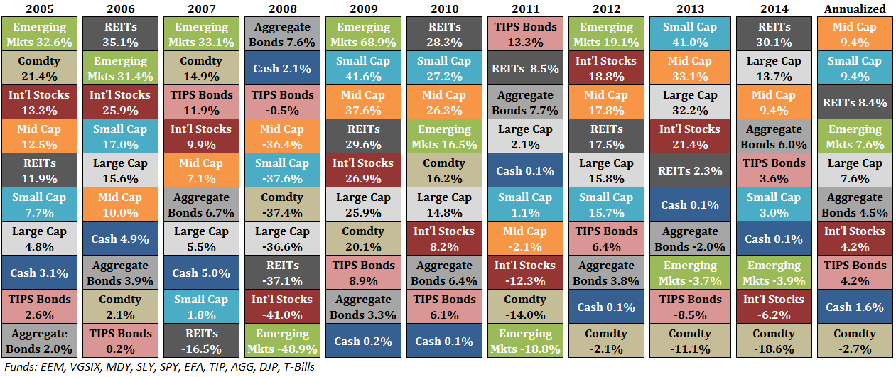
The reason this is my favorite performance chart is because it shows how humbling the investment business can be. There’s little consistency from year-to-year as each asset class takes its turn in the different slots.
A few observations on the past 10 years of data:
- After a bull market in the early-to-mid 2000s, commodities have been a nightmare for investors. Over the past 10 years commodities are down by 25% while they’re down 40% since 2011 alone. The fact that the safest short-term asset on earth – cash – has outperformed commodities by over 4% a year doesn’t help either.
- Foreign developed markets (Int’l Stocks) have acted as a weight around the neck of globally diversified investor these past 10 years. It’s always going to be something.
- The size premium has been out in full force as small and mid cap stocks have outpaced their larger counterparts in the U.S. stock market over the past decade. This relationship didn’t hold in 2014, so we’ll see if it’s a trend that is finally going to reverse after smaller stocks have outperformed handily since 2000.
- A diversified real estate portfolio (REITs) has performed admirably considering we went through one of the worst real estate crashes of all-time in the last decade. This probably says more about the interest rate environment than anything else.
- Bond volatility will increase at some point if we ever get that rising rate environment everyone has been predicting. But over the past 10 years the AGG has a standard deviation of less than 3% — basically no variation in performance from year to year. It’s been an impressive run for high quality bonds.
- On the opposite end of the spectrum, emerging markets have by far the highest volatility, which is apparent from the fact that it’s been the top performer 4 times and the worst twice.
While the mean reversion that Kahneman describes with the Israeli pilots does exist in the financial markets, the timing is always tricky. It’s very difficult to know when those below or above average flights are going to take place. Sometimes trends reverse from one year to the next while other times there are long periods of over- or under-performance in certain segments of the market.
The most important takeaway I get from looking at this asset allocation quilt every year is that it’s basically impossible to predict the winner in any given year and I’ve yet to find an investor that’s able to do so.
Peter Bernstein summed up the conclusion for this table better than I could when he said, “The riskiest moment is when you’re right. That’s when you’re in the most trouble, because you tend to overstay the good decisions. So, in many ways, it’s better not to be so right. That’s what diversification is for. It’s an explicit recognition of ignorance. And I view diversification not only as a survival strategy but as an aggressive strategy, because the next windfall might come from a surprising place.”
Further Reading:
Lessons from Thinking, Fast and Slow
Unlearning From Peter Bernstein
Now for my favorite reads of the week:
- The pros and cons of a go-anywhere fund (Bason)
- The 2014 Silver Bullet Awards expose this year’s market myths (Dash of Insight)
- How Sherlock Holmes can make you a better investor (Millennial Invest)
- Are institutional investors actually smart with their stock picks? (Alpha Architect)
- You suck at investing – But we all do (Dragonfly Capital)
- Don’t interfere with your investment strategy (Irrelevant Investor)
- 3 investing lessons from Coolio (Malice For All)
- Why the good times teach bad lessons (Reformed Broker)
- 5 pieces of good news you may have missed in 2014 (Bill Gates)
- Investing advice for a new addition to the family (Clear Eyes Investing)
- “I make investment changes at a glacial speed.” (Rick Ferri)
- A magician’s best trick — revealing human bias (WSJ)
Subscribe to receive email updates and my monthly newsletter by clicking here.
Follow me on Twitter: @awealthofcs

Great chart! Is it possible to find this graphic for a longer timeframe (even back to the ’90’s or 80’s)?
See the very bottom of this post from James:
http://www.basonasset.com/3-things-i-learned-in-2014/
It goes back to the mid-1990s. It would be interesting to see something like this going back to the 80s. Maybe a project for another day that I’ll have to look into.
A bit more sense can be made of the asset quilt by letting similar assets compete against each other — domestic stocks vs. intl stocks, large cap vs small cap stocks, etc.
One never catches the exact turning points. But some of these trends in relative performance endure for years.
Valid point. I think the biggest problem for most average investors is that they want to only be involve in THE asset class every year. But you’re right and the glaring one in this data is US over developed int’l mkts since 2008.
A model I run (adapted from Gary Antonacci’s book Dual Momentum) compares 12-month momentum on domestic and foreign stocks.
At end-Aug 2011 it switched to domestic stocks. Since then the S&P 500 gained a cumulative 81.5% versus 21.1% for the ACWI ex-USA index.
As of Dec. 31st, the S&P’s 12-mo momentum is +13.69% vs -3.44% for the ACWI ex-USA. So the model still strongly favors domestic equities.
Nice. So you go all-in or all-out or are you just tilting one way or the other? Also, I still need to read Gary’s book, but what momentum signals does he use? Is it just relative and absolute?
[…] Updating My Favorite Performance Chart by A Wealth of Common Sense […]
Many of the mutual fund companies and brokerages produce similar “jellybean” charts going back 20 years. Some add the “diversified portfolio” categaory as well that generally tracks along the middle each year and for the cumulative period.
Yes, I thought about doing that with an equal-weighted portfolio. I’ve done something similar in the past. See here:
https://awealthofcommonsense.com/diversification-investment-cycles/
[…] Carlson shares Updating My Favorite Performance Chart at his blog A Wealth of Common […]
[…] ← Previous […]
[…] the winner in any given year and I’ve yet to find an investor that’s able to do so,” he writes on his blog, A Wealth of Common Sense, where he presents a “humbling” asset allocation quilt for the last […]
Love the quilt!
All the best in 2015 Ben, stay in touch,
Mark
Thanks Mark. Same to you. Happy new year.
[…] Ben Carlson released an updated asset allocation quilt. […]
[…] Yearly Asset Performance Chart (Credit: awealthofcommonsense.com) […]
[…] Reading: Updating My Favorite Performance Chart The Style Box of the […]
[…] whole thing is silly. Have a look at the Asset Allocation Quilt below from the really excellent A Wealth of Common Sense blog. The important lesson in this graphic is that it’s silly to try to chase growth by […]