It’s intelligent behavior to see the other side of an argument in the markets because no one is right all the time and it’s easy to become blinded by our own beliefs.
With this idea in mind, allow me to share some recent charts and statistics I’ve come across in recent weeks along with an argument on both sides of the bullish and bearish sides of the aisle.
This chart shows that world equity markets are fast approaching $100 trillion in overall market cap:
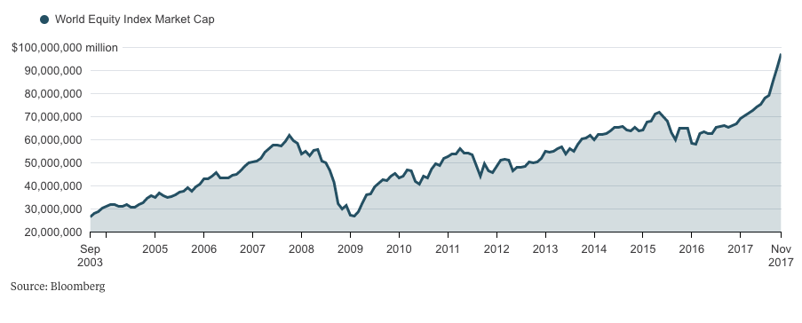
Round numbers don’t signify anything of substance but the rise since 2016 is fairly pronounced here and has obviously risen to heights it’s never been before. New highs are both great and scary because eventually stocks will reach the high (at least for a while). On the other hand, this number was basically unchanged from the peak in 2007 through early-2016 in what was more or less a lost decade.
This one from Dana Lyons shows that household allocations to stocks is higher than it’s been at any point outside of the dot-com bubble:
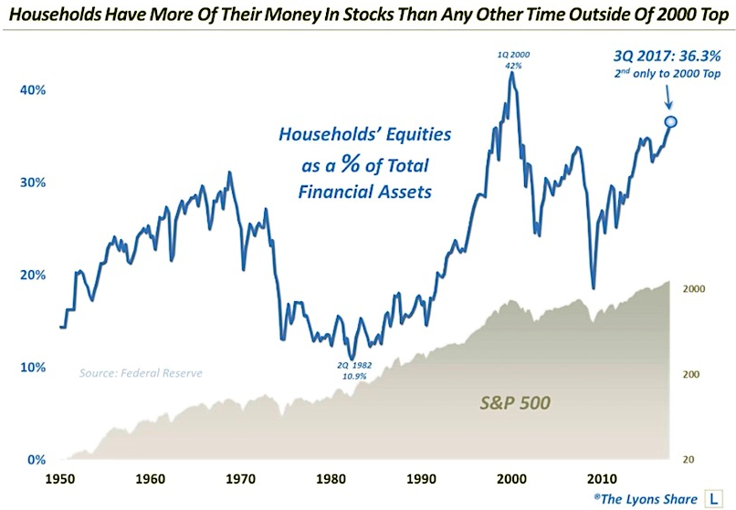
While the rise in stocks has a lot to do with this, it would be hard to argue that this is still “the most hated bull market of all-time” considering these numbers. However, people are living longer, many people have undersaved for retirement, and allocations of less than 40% still seem low in the grand scheme of things in terms of overall risk exposure.
Valuations are also at the highest levels they’ve been since the tech bubble:
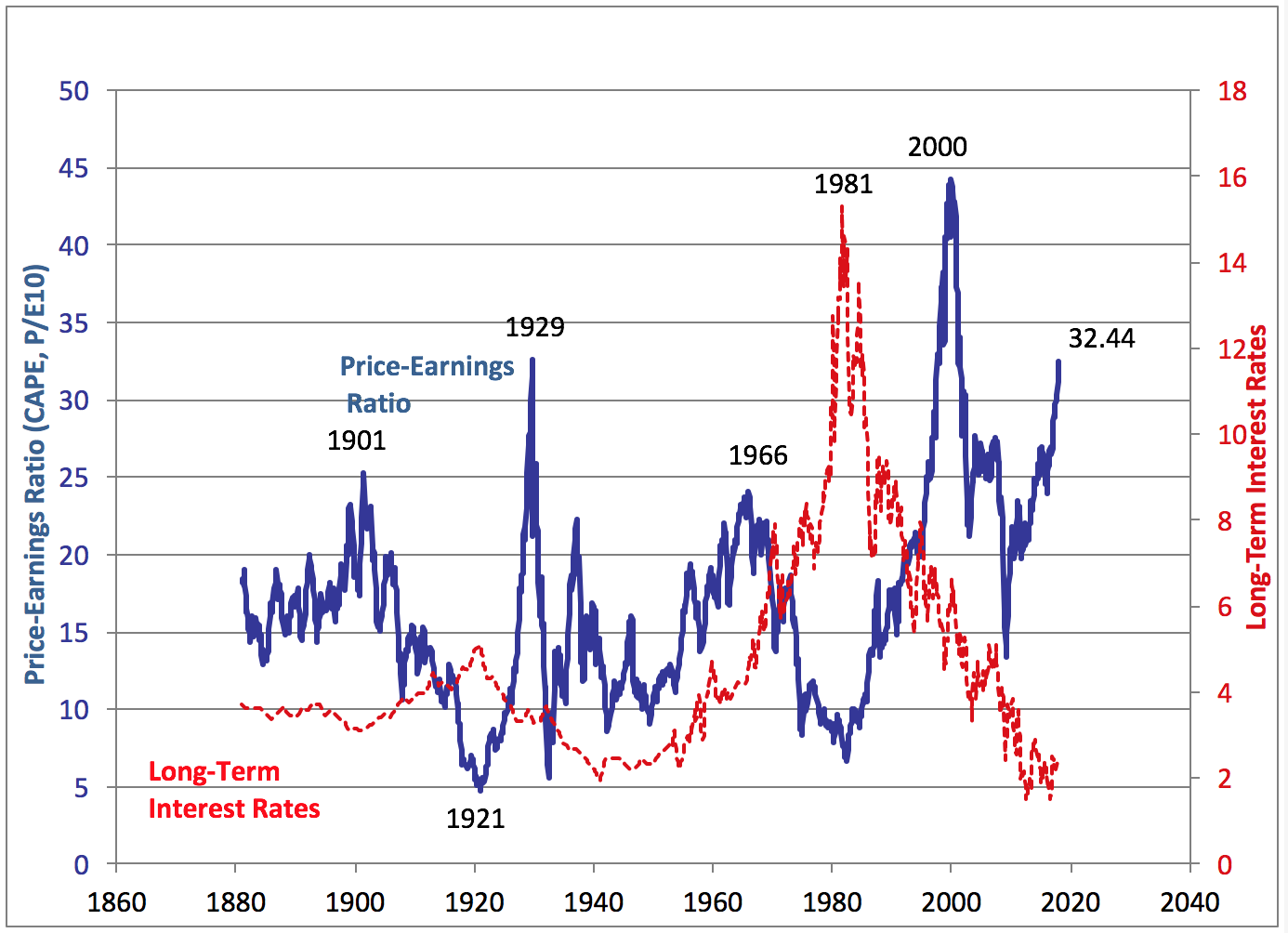
The CAPE ratio has now surpassed the 1929 high and trails only the 2000 peak in terms of long-term valuations. The higher the valuations, the more you’re paying for each dollar of earnings power, and thus the lower your expected returns should be for the future. 2000 and 1929 also happen to coincide with two of the worst market crashes in history.
Having said that, two is a fairly small sample size, the CAPE ratio is flawed (as is all single variable analysis), the corporate world and markets have changed substantially over this time frame, and higher valuations doesn’t mean a market crash is written in stone, just that investors are currently willing to pay a higher multiple of earnings to own stocks.
The other (red) line on this chart shows that interest rates have done the complete opposite of valuations, which, along with low inflation figures, could have something to do with the high stock market valuations. But, if interest rates (or inflation) should ever rise substantially, as people have been predicting for a number of years now, things could get ugly in the stock market.
Profit margins have also been rising for years and sit near record highs:
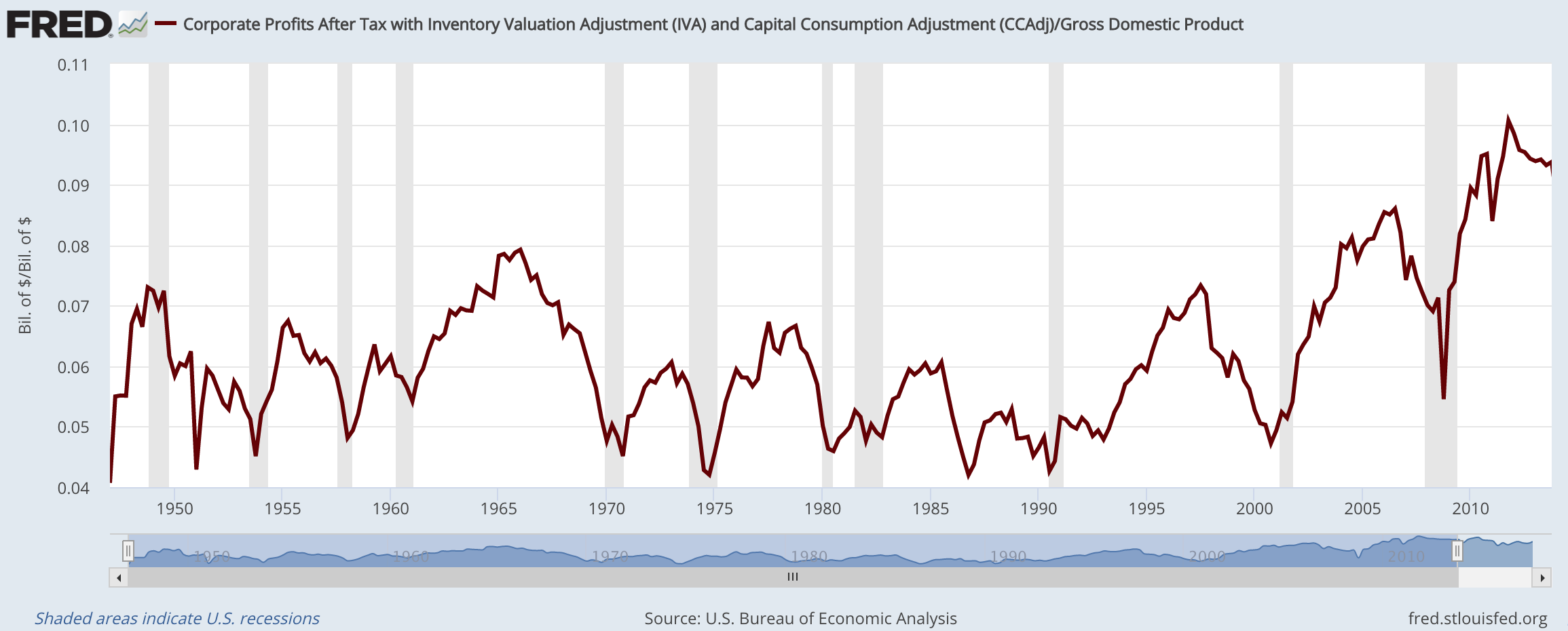
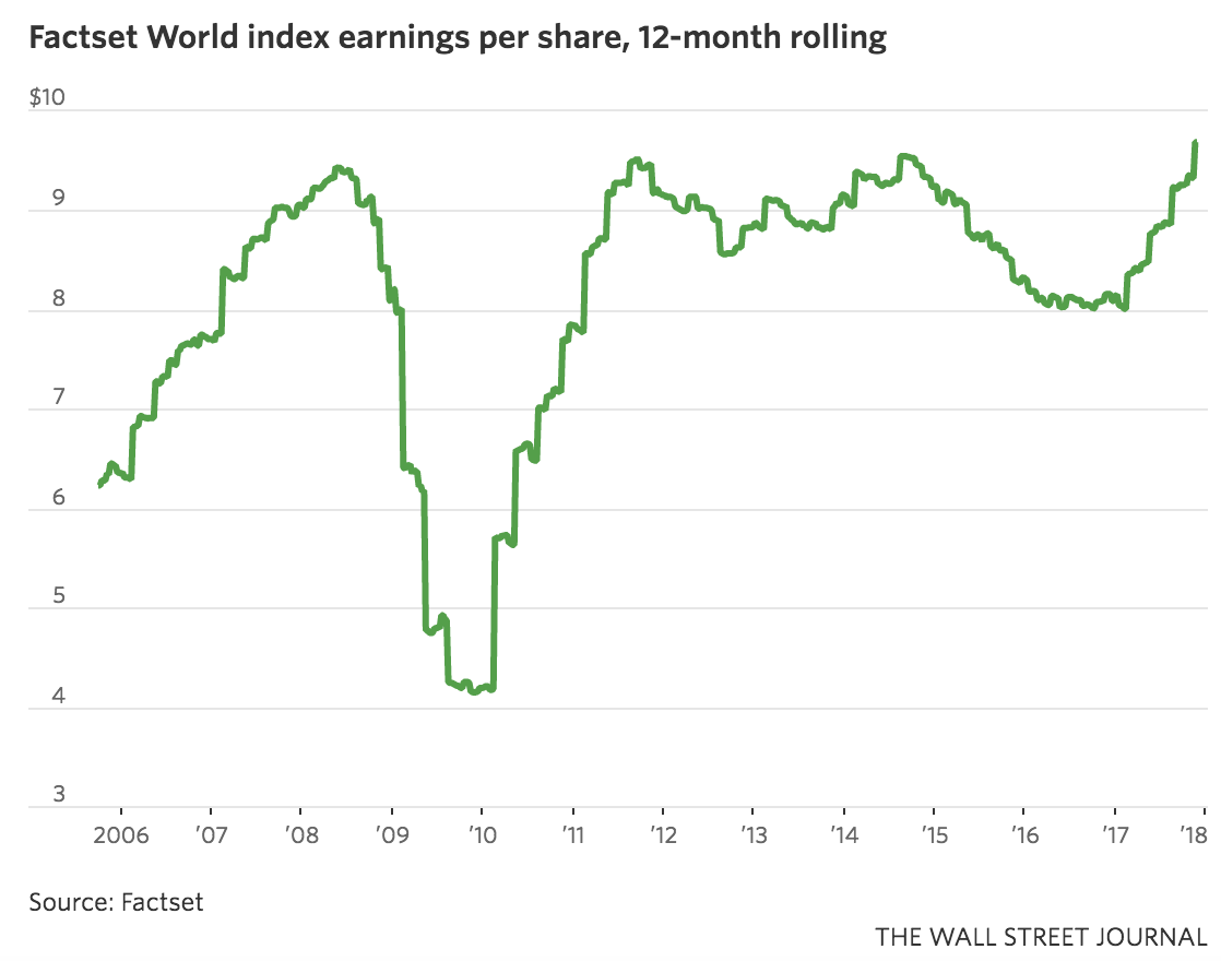
The huge worry about profit margins is that they will revert back to a long-term average, as they have done in the past at some point in every cycle. If margins were to fall, it could cause a massive re-pricing of stocks since the record high earnings would take a hit (seen here):
This makes sense in the textbook sense of how competition works in business but mean reversion doesn’t happen just for the sake of happening. There needs to be a legitimate reason for a reversion to the mean in profit margins or anything else.
It’s also true that a large percentage of profit comes from overseas these days as the economy is much more global in nature. Technology has also given rise to much less labor-intensive business models which has led to an increase in margins for a wide range of companies. If a dataset changes enough, the historical mean becomes much less meaningful (pun intended, I guess).
We’re also dealing with the fact that the S&P 500 is going on its 9th straight year of gains. 2008 is actually the only down year in stocks since 2003, meaning the S&P will have risen 14 out of 15 years once 2017 is in the books.
The other side of this is that stocks were more than chopped in half from the peak in 2007 to the low in 2009. And in 2011 there was a near-20% drop along with a double-digit fall from late-2015 to early-2016. Plus, even though the stock market bottomed in March of 2009, the peak levels from 2007 weren’t breached until 2013, a full four years after this recovery in the markets began.
I could continue this market point/counterpoint tennis match all day. The truth of the matter is that nothing is ever black or white when dealing with the complexities of the markets. There will always be legitimate arguments to be made on both sides of the aisle.
You could easily talk me into believing stocks will continue to march higher, even in the face of high valuations. Rates could stay low for a prolonged period and the economic recovery could continue to slowly grind away without getting too hot or too cold for a few more years.
OR
Stocks could get crushed. Inflation (remember that?) could rear its ugly head and offer investors an actual alternative to stocks by driving bond yields higher. Profit margins could get destroyed in this scenario and finally revert to the magic mean that so many people have been predicting for years now.
OR
Maybe something else happens like stocks going nowhere for a while and frustrating everyone. Maybe the U.S. takes a breather for a while and allow foreign markets to finally have their day in the sun. Maybe commodities or some other beaten down asset class takes a turn at the head of the class.
None of these scenarios are too far-fetched when you consider the possibilities. The best we can do is think in terms of a huge distribution of outcomes and approach the markets with an understanding that no one has it all figured out. This isn’t the answer most investors are looking for but that’s the reality.