Brett Arends from MarketWatch has an interesting piece out this week that looks at the historical returns on the U.S. stock market. He goes through some research that shows some damning evidence about the long-term returns in U.S. stocks:
Since 1982, for example, the stock market has gone up by an average of 6.5% a year, on top of inflation.
But prior to 1982, over a long stretch of history, it went up by one-tenth as much. That’s right. From 1915 through 1982, the average annual rise of the stock market, after accounting for inflation, was just 0.6%. Yikes.
[…] But, astonishingly, 95% of that gain has come since 1982. From 1915 to 1982, over almost 70 years, the market ended up going virtually nowhere. Capital gains — before taxes and costs — amounted to just 50%, in total, over 67 years.
Yikes indeed. But is this correct? Are stock market returns since the early 1980s an aberration? Being a market history buff I had to look into the numbers on these claims because it just didn’t sound right to me.
I have the S&P 500 return numbers from the Center for Research in Security Prices (CRSP), the gold standard when it comes to historical market data, going back to 1927. Here’s what I found when I ran those numbers:
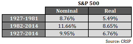
Returns since 1982 are definitely above average. There’s no denying that. But the after-inflation returns from 1927-1981 are still pretty respectable. And you have to remember that these performance numbers include the Great Depression, which saw the market fall by over 80% at the start of this period. I looked at the results from 1933-1981, which exclude the Great Depression, and they look pretty good — 10.92% nominal and 6.52% real. You could play that game all day with different variations and periods, but it still appears that pre-1982 returns actually offered a very good return over the rate of inflation.
So I figured the returns from 1915-1926 must have been horrendous to cause the terrible long-term performance Arends listed. Actually, those returns were better than average. I looked at Robert Shiller’s long-term data on real returns, and including dividends, stocks were up nearly 170% or more than 8.5% per year after inflation in that time. Combining those two data sets gives us a real return of almost 6% per year from 1915-1981, just shy of the long-term average.
So why the difference in performance numbers? I can’t say for sure without looking at the methodology used. It’s possible the returns Arends is using don’t include reinvested dividends, which make up the bulk of your returns over the long haul. Dividends yields were also much higher in the past. I suppose certain historical data sets use different assumptions on which companies they include.
Regardless, it appears that stock returns since the early 1980s are just above average, not some historical quirk. Investors do need to understand that it’s highly unlikely that the stock market will have a repeat of those same returns going forward. But the U.S. stock market has been a compounding machine since the early-1900s. As long as people continue to innovate and set out to improve their lives I see no reason why stocks can’t give investors a decent return above the rate of inflation in the future.
Betting against human ingenuity has always been a bad idea.
Source:
Here’s why expecting U.S. stocks to make you rich would be a mistake (MarketWatch)
Further Reading:
What Are Your Actual Returns?

[…] Meanwhile, “the U.S. stock market has been a compounding machine since the early-1900s. As long as people continue to innovate and set out to improve their lives I see no reason why stocks can’t give investors a decent […]
I have read that article. It is very false. Maybe Brett should read the book: Stocks for the long run by Jeremy Siegel. I think he wanted to write a provocative article so simple shunned the dividends. I am astonished the marketwatch let him to write it.
I think he likes to be an uber-contrarian at times to try to make some waves, but you can’t always be a contrarian. Also, probably should have checked those numbers before running them or at least put some context behind them.
Ben, I wouldn’t say the returns or performance of the stock was an aberration simply because markets are reactionary to the forces around them; in other words markets are merely displaying the end results of certain events.
What I would call an aberration is the political, economic, and financial events of 1980 onward which resulted in the seemingly out of line market returns of the same period.
Things such as a 35 year declining interest rate, the axing of the GS Act, the creation of the GLB Act, the increasing flow of debt fuelling the 35 year stock market gleefest, the beginning of the globalisation and off-shoring trends, throw in all kinds of newly invented accounting tricks and derivatives, and you’ve got all the aberrational ingredients you can handle.
As for innovation, I think that has been put on the back-burner since 1982 in favour of the aforementioned — why spend so many resources to create organic gains when you can merely rely on passive forces to hand you gains?
Will be interesting to see what type of ingenuity the next generation of investors brings to the market, and the effects on return.
Good point. There were a whole bunch of forces (including demographics) that all came together at once to create that market environment. I agree that the future will be an interesting place, as always.
See this one I wrote a while ago on the book Abundance for some possibilities:
https://awealthofcommonsense.com/future-better-think/
Over the past several weeks I have seen three slightly different nominal returns stated for the S&P 500 from 1927 through 2014 in some of your blogs – 9.6%, 9.7%, and in this article 9.95%. Which is the correct number? Not being picky here. Just want the most accurate number. Thanks.
Good question. I have a couple different data sources. One from Damodaran at NYU only goes back to 1928. The other one from CRSP goes back to 1927. That’s probably why you’re seeing a difference. And honestly there are times when these data providers use slightly different assumptions for the historical data in the pre-1960s era. That could also explain the minor differences.
Global Financial Data’s write-up for their S&P 500 price file states, “Daily indices were introduced in 1928 and consisted of a 90-stock average including 50 industrials, 20 rails and 20 utilities. Data were calculated on a weekly basis back to 1926 and 1927.”
And indeed, their S&P prices for 1926 and 1927 are weekly, with the dates not necessarily corresponding to the end of the month.
Dow Industrials, Rails and Utilities series are available daily going back to the 19th century. So one can use an appropriately weighted daily Dow composite to interpolate between the weekly S&P values, with only fractional errors. Yes, I actually did this.
But it’s really total return that’s of the most interest. The Ibbotson SBBI Yearbook presents a month-end S&P total return series beginning on Dec. 31, 1925, the same date CRSP’s stock files begin. It’s probably the most authoritative source.
That’s true. And the one many use since the 1960s is Compustat. As always, the past can be used to assess risk and make higher probability decisions, not predict the future.
Arends’ chart is labeled “Price index, top 500 stocks, adjusted for inflation.” It corresponds to Column H (real price of S&P 500) in Robert Shiller’s dataset, where Dec. 1914 had a real S&P index of 172.34 and Dec. 1981 had a real index of 311.89, or 81% higher — not “50%,” as Arends claims.
If one cherry picks even more carefully, using the real price of 211.96 at the end of 1915 (the largest up year of the 20th century) and the real price of 338.24 at the end of 1982, that’s a gain of 55%. But Arends’ chart begins at the end of 1914, with a first label of 1915.01.
What’s the point of measuring real, price-only return from a cherry-picked secular high to a cherry-picked secular low 67 years later? Robert Shiller uses the real price to derive his CAPE ratio, not to measure returns.
It just goes to show that by following your own trading decisions, you have some chance of beating the market. But if you listen to financial journalists, your chance of beating the market goes to zero, as they are infallibly wrong.
Good point. Didn’t realize that about 1915. Nice dinner conversatino trivia for finance-types. Agree it’s easier to sensationalize these things than to look at them objectively. Somehow the lesson many took from 2008 was that fear mongering is better than common sense. Not a great way to look at the world.
[…] A Wealth of Commons Sense – are stock returns since the 80s an outlier – or can we expect something similar going forward? You’ll have to read (and think) […]
[…] Reading: Are Stock Market Returns Since the 1980s an Aberration? What Are Your Actual Returns? Did Bill Gross Tip the Pop Machine […]