Here’s a round-up of some of my favorite charts from 2021:
The U.S. stock market as a whole was basically devoid of volatility this year:
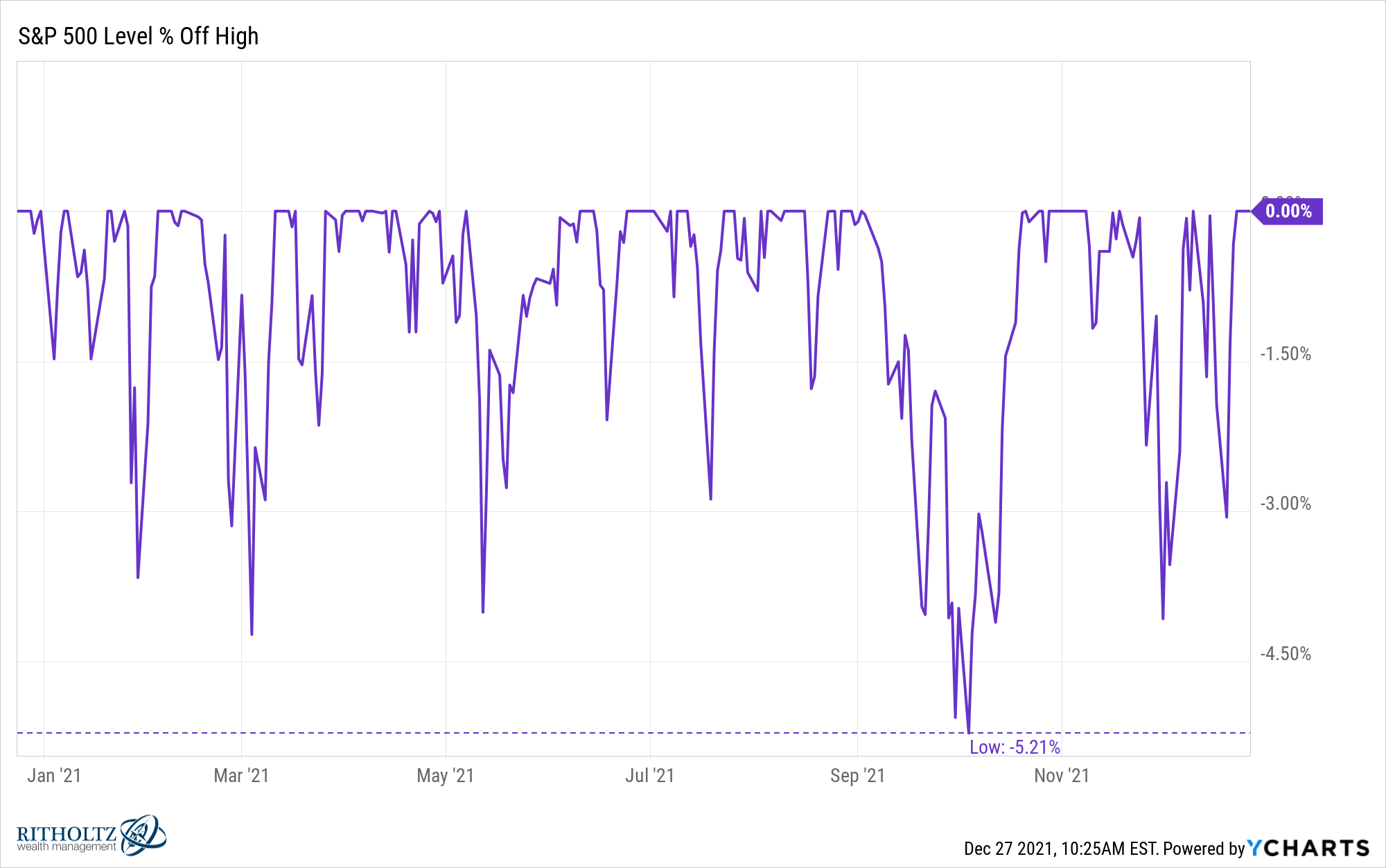
In fact, out of the past 94 years of data, this year ranks as the 9th lowest peak-to-trough drawdown in a calendar year.
Of course, there were certain parts of the market that got clobbered this year. Many growth stocks that soared in 2020 got shellacked in 2021:
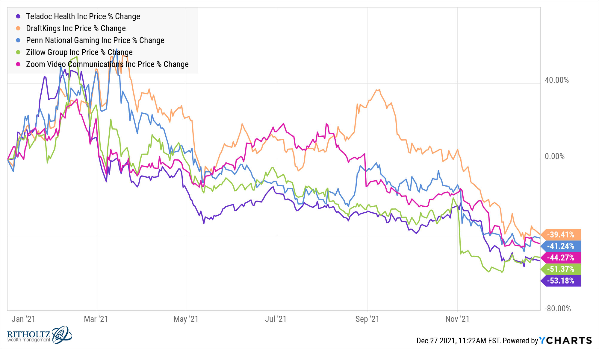
Teladoc, DraftKings, Penn National Gaming, Zillow, and Zoom were up 139%, 335%, 238%, 183% and 396%, respectively in 2020. And all of these stocks were up anywhere from 30-60% in the early months of 2021 as well. The current drawdowns for these stocks are all now in the range of -58% to -68% from their highs in 2021.
Every year there are stocks that get massacred but these names are notable because they became so beloved by so many investors the higher they went.
Yet the massive moves in these growth stocks pales in comparison to what went on with the meme stocks this year. GameStop and AMC are a sight to behold:
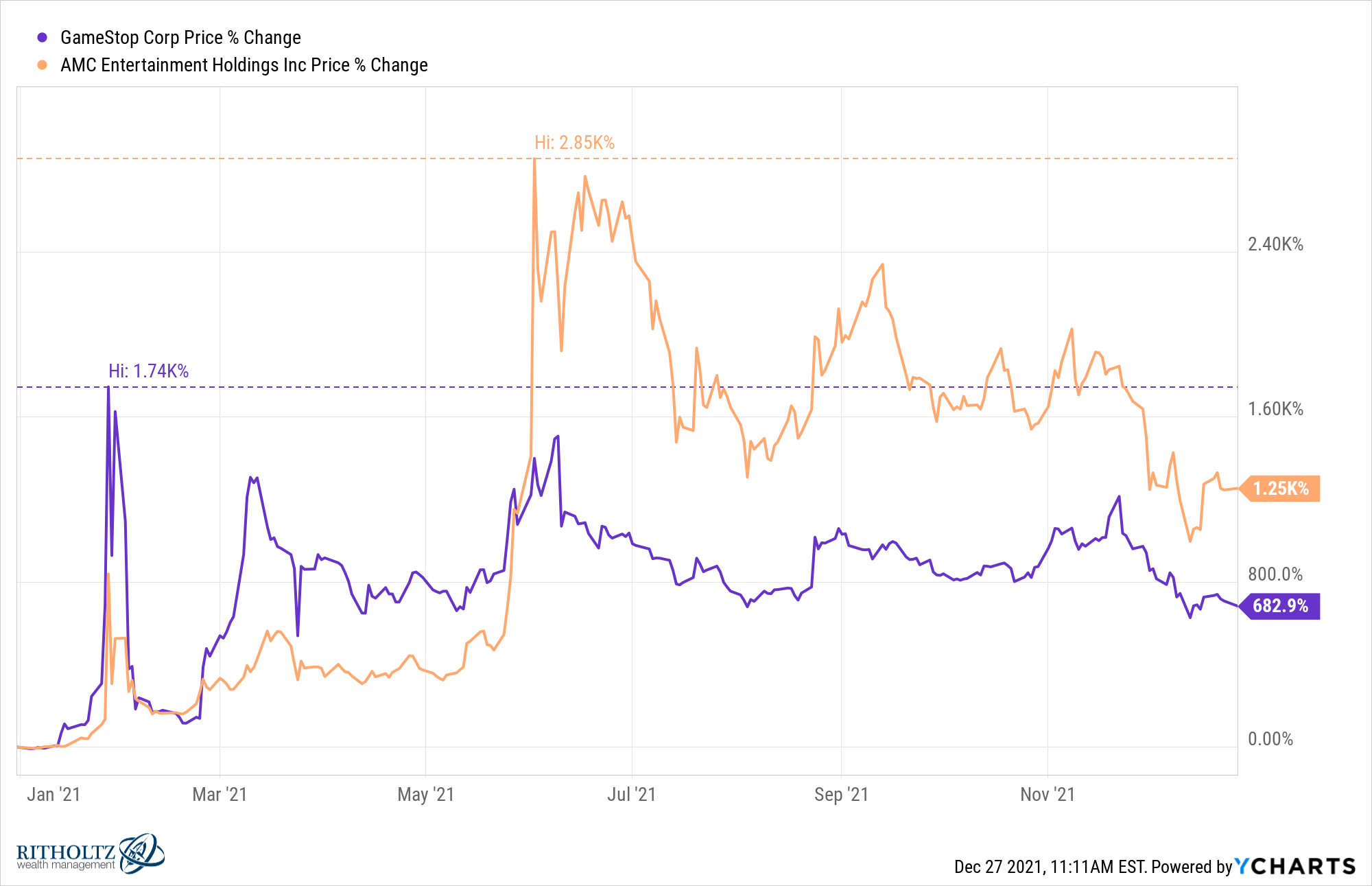
These stocks are both down well over 50% from their highs yet are still up nearly 700% and 1200% respectively in 2021.
Here were their market caps at beginning of the year:
- GameStop: $1.2 billion
- AMC: $475 million
And the market caps now:
- GameStop: $14.8 billion
- AMC: $11.3 billion
I count myself in the camp that assumed this whole ordeal would be over in a matter of weeks or months. Instead, the herd continues to keep these stocks elevated. I don’t think we’ve ever seen anything like this go on for this long.
On the macro side of things, inflation has dominated everything in the back half of the year:
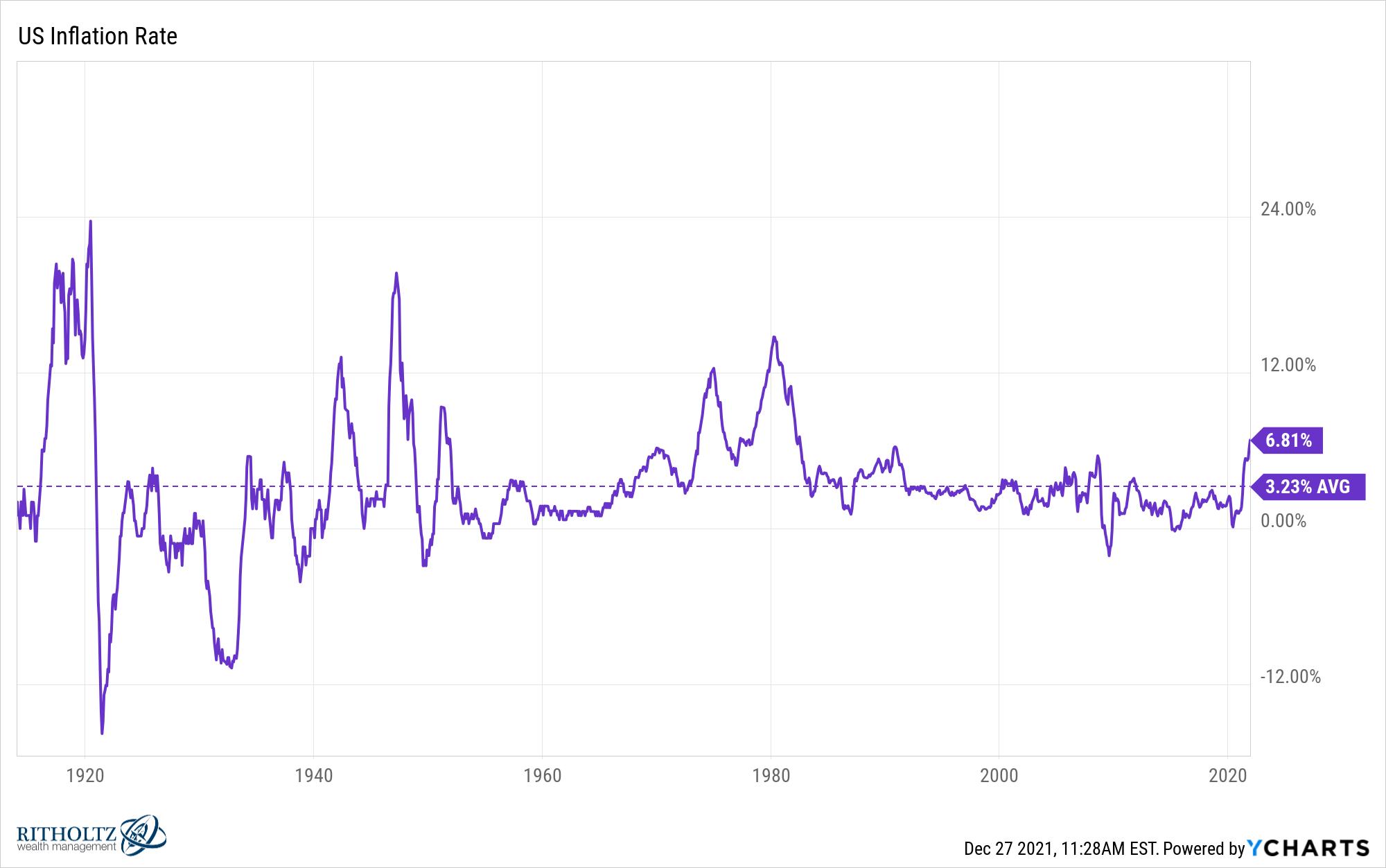
It’s been a while since we’ve been this much higher over the really long-term average inflation rate of 3.2%. My one big takeaway from this chart is inflation is always moving and rarely stable from one 12 month period to the next.
The craziest inflation piece is the massive spike in used car prices:
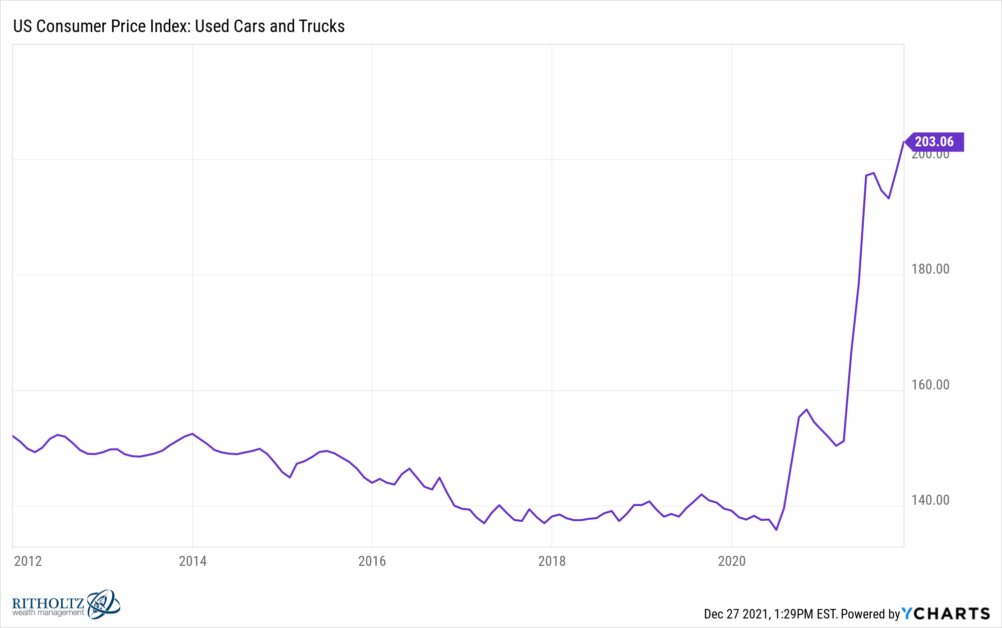
This one has to be transitory, right?
Speaking of inflation, I’ve probably used the following chart in no less than 5 blog posts which is why it deserves a spot on this list:
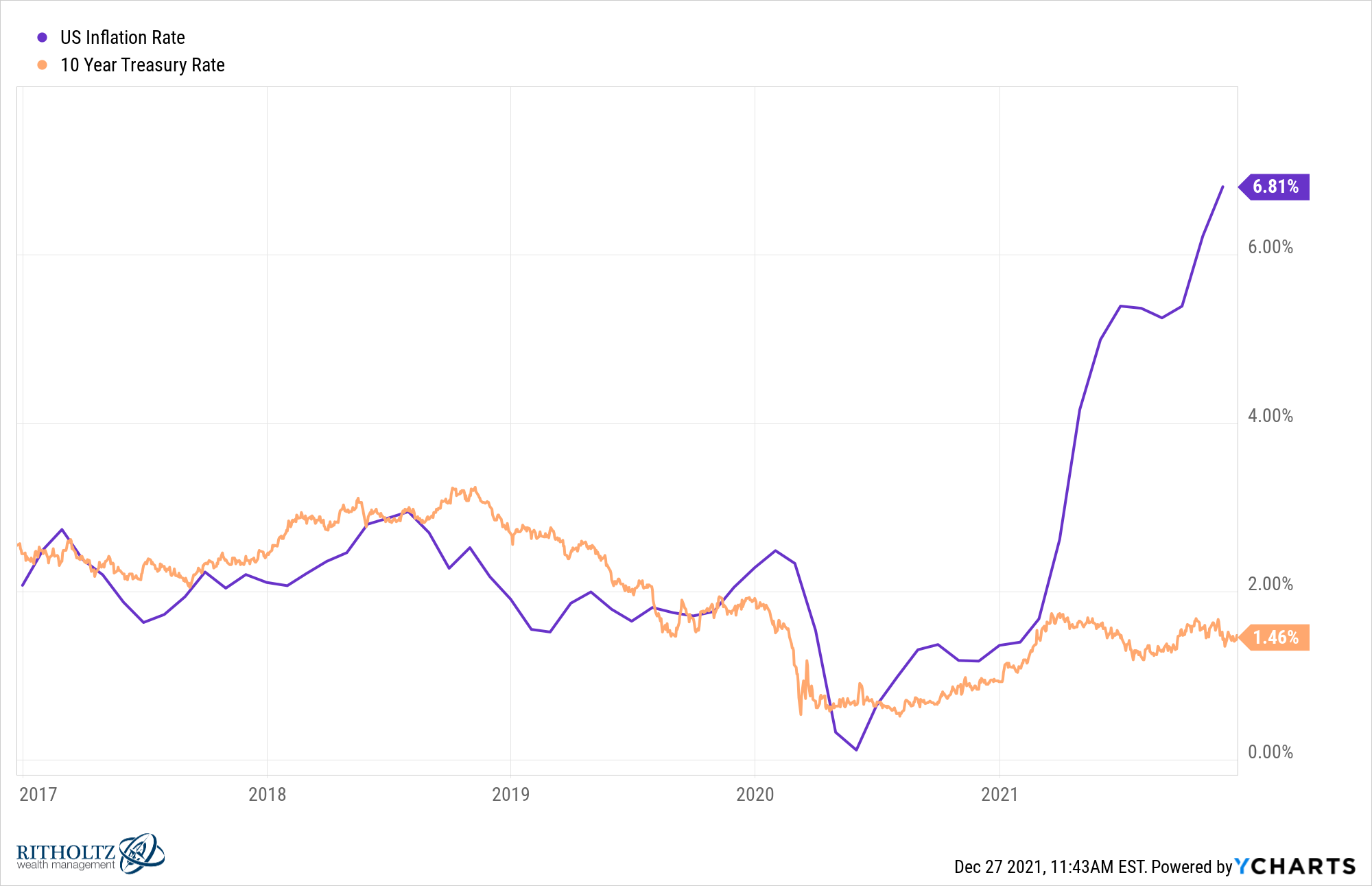
There are plenty of reasons rates have remained low but this year was probably the best scenario in 50 years for yields on government debt to rise substantially and it just didn’t happen.
If you would have told someone this year would include hundreds of thousands dead in a prolonged pandemic, an attack on the U.S. Capitol, massive government spending and the highest inflation in almost 40 years, buying gold would seem like a reasonable conclusion.
Instead, gold has underperformed the U.S. bond market:
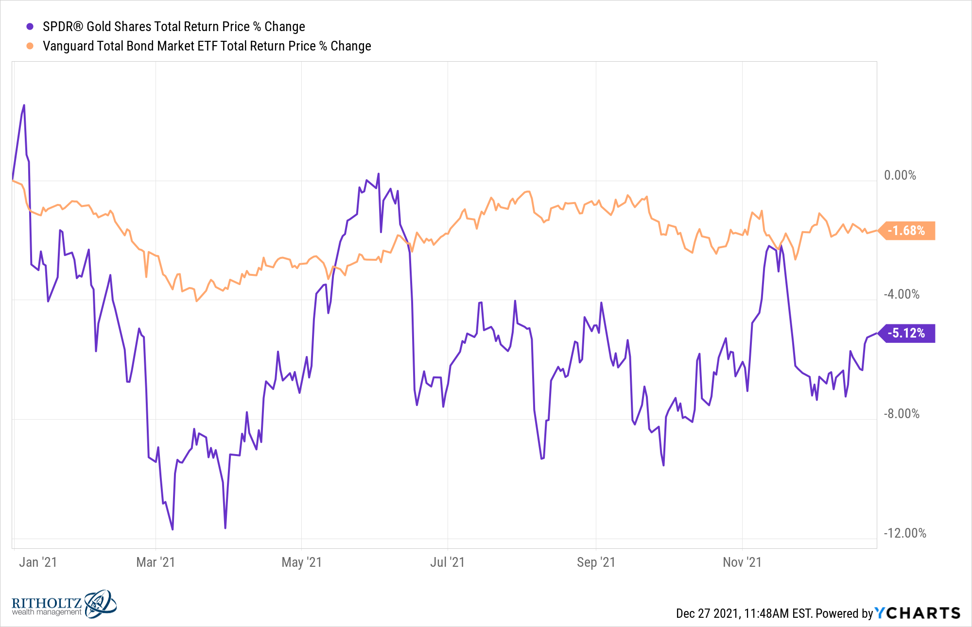
You could have nailed the macro going into this year and still lost money. Markets remain hard.
The crazy thing is, gold rising when inflation is higher was far from a sure thing. The sure thing should have been bonds getting hammered. Instead, the aggregate U.S. bond market is down marginally:
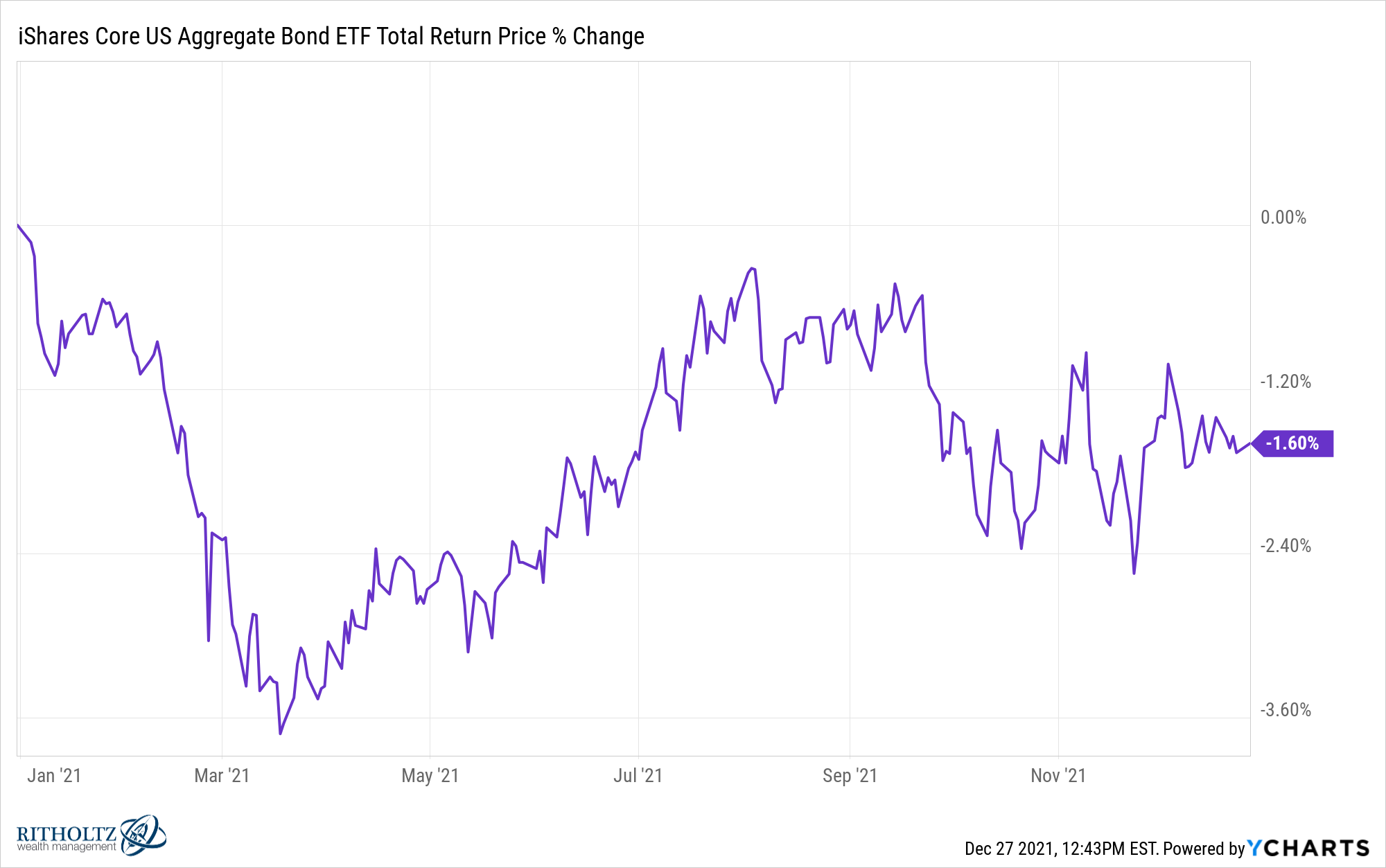
The Bloomberg Aggregate Bond Market Index goes back to 1976. This year’s -1.6% return (should it hold over the next few days) would be the third-worst year ever for this benchmark in that time. In fact, the Agg has only ever had 3 down years out of the previous 45. The losses are -0.8%, -2.0% and -2.9%.
This is a good reminder that a bad year in the bond market is a bad afternoon in the stock market.
Any look back at 2021 has to include something about the scalding hot housing market:
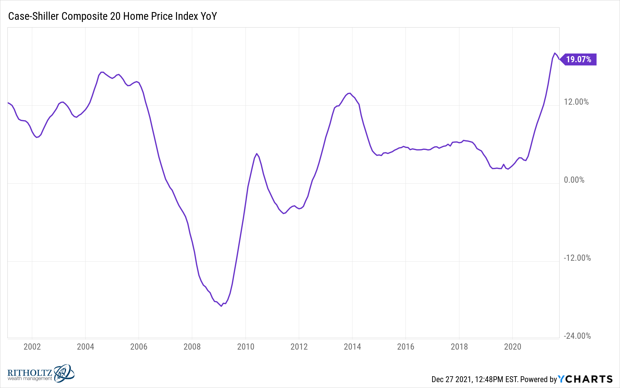
This was likely the greatest 12 month period we will see in housing prices in my lifetime.
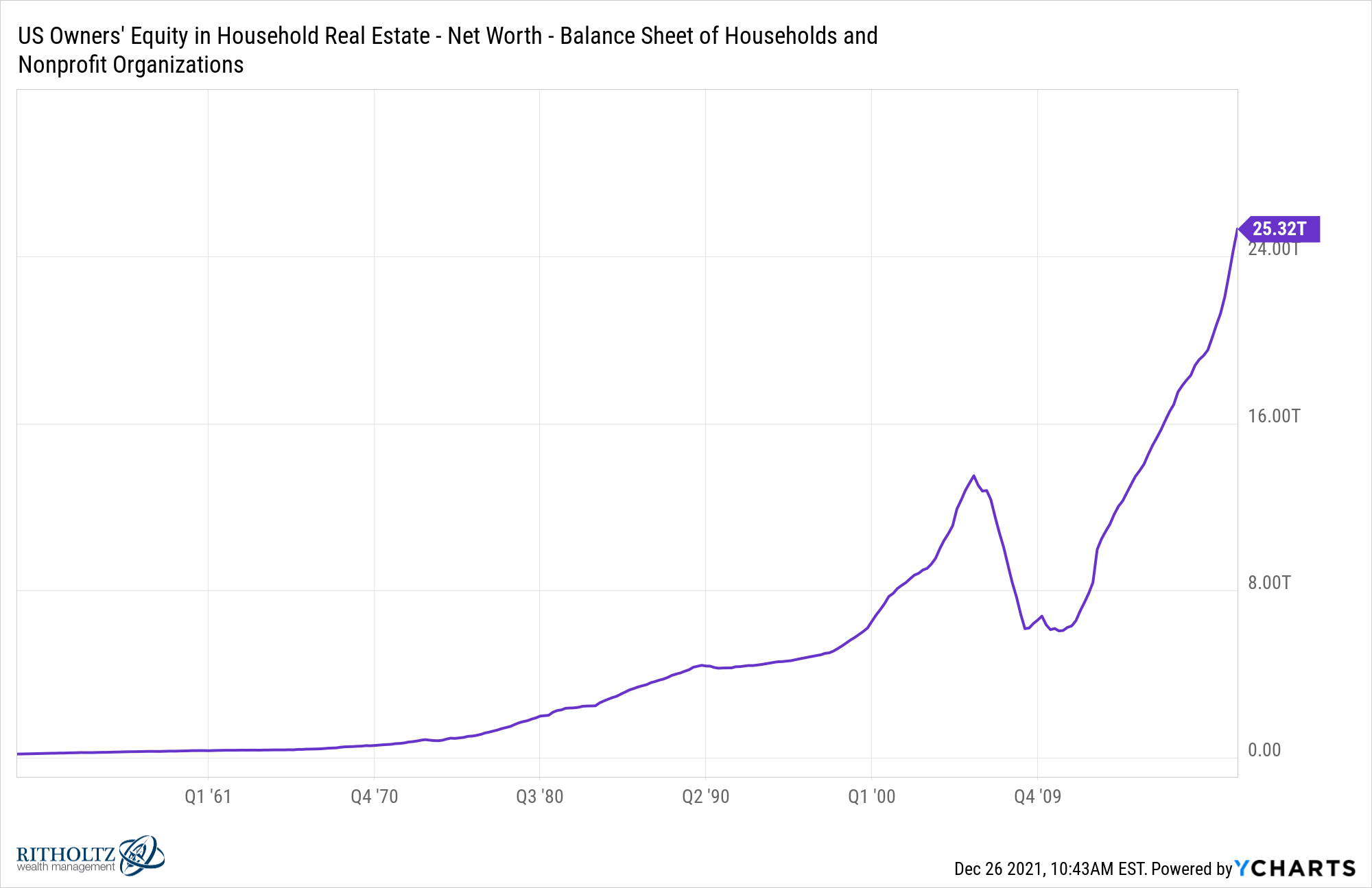
Just look at the spike in home equity:
This is all happening as people are paying less and less to service their mortgage debt since borrowing rates are so low:
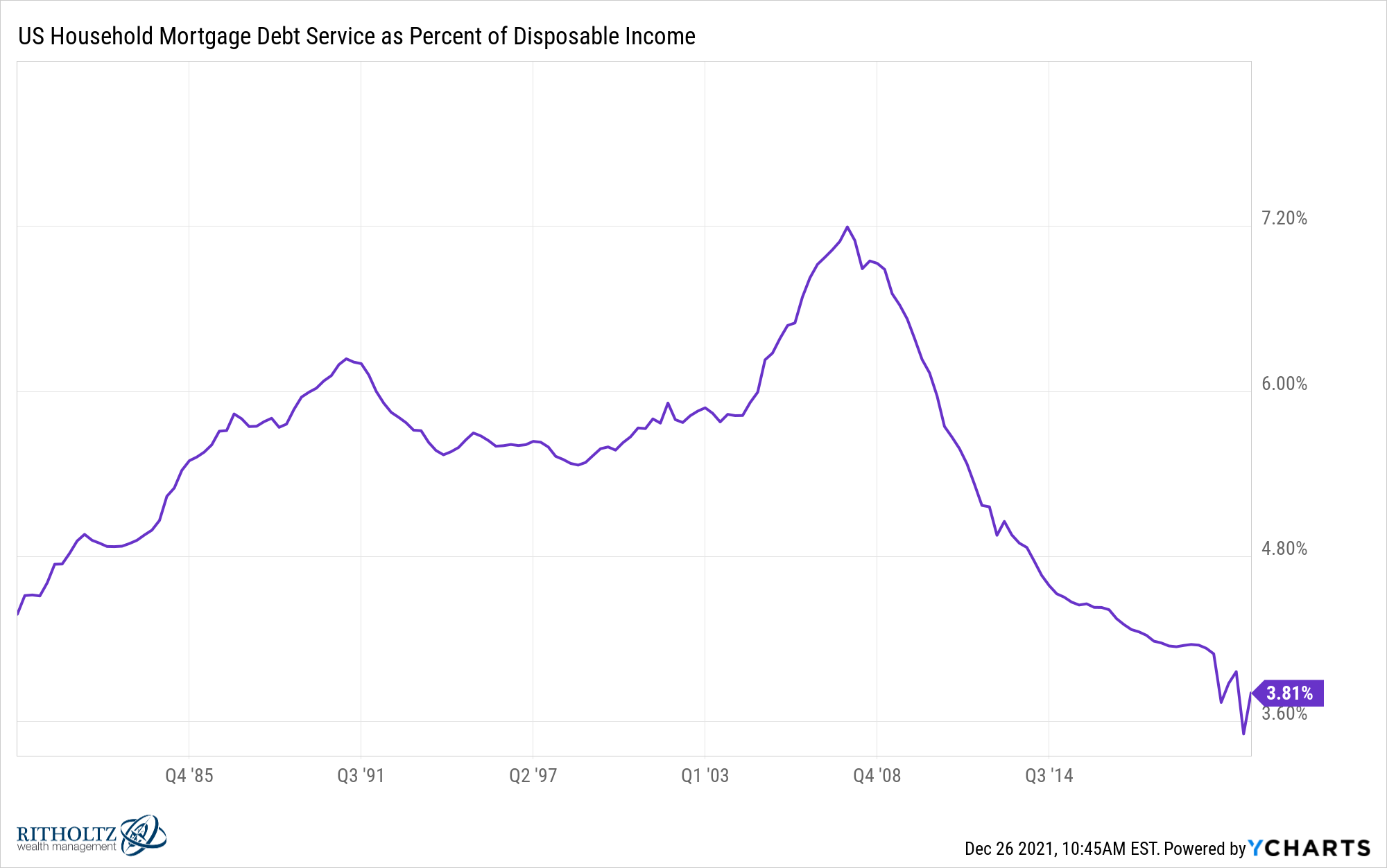
I would be shocked if people don’t begin monetizing this equity in the years ahead. Two-thirds of the country owns a home and most of those homeowners are sitting on massive gains.
That money is going to get spent in the years ahead by many households.
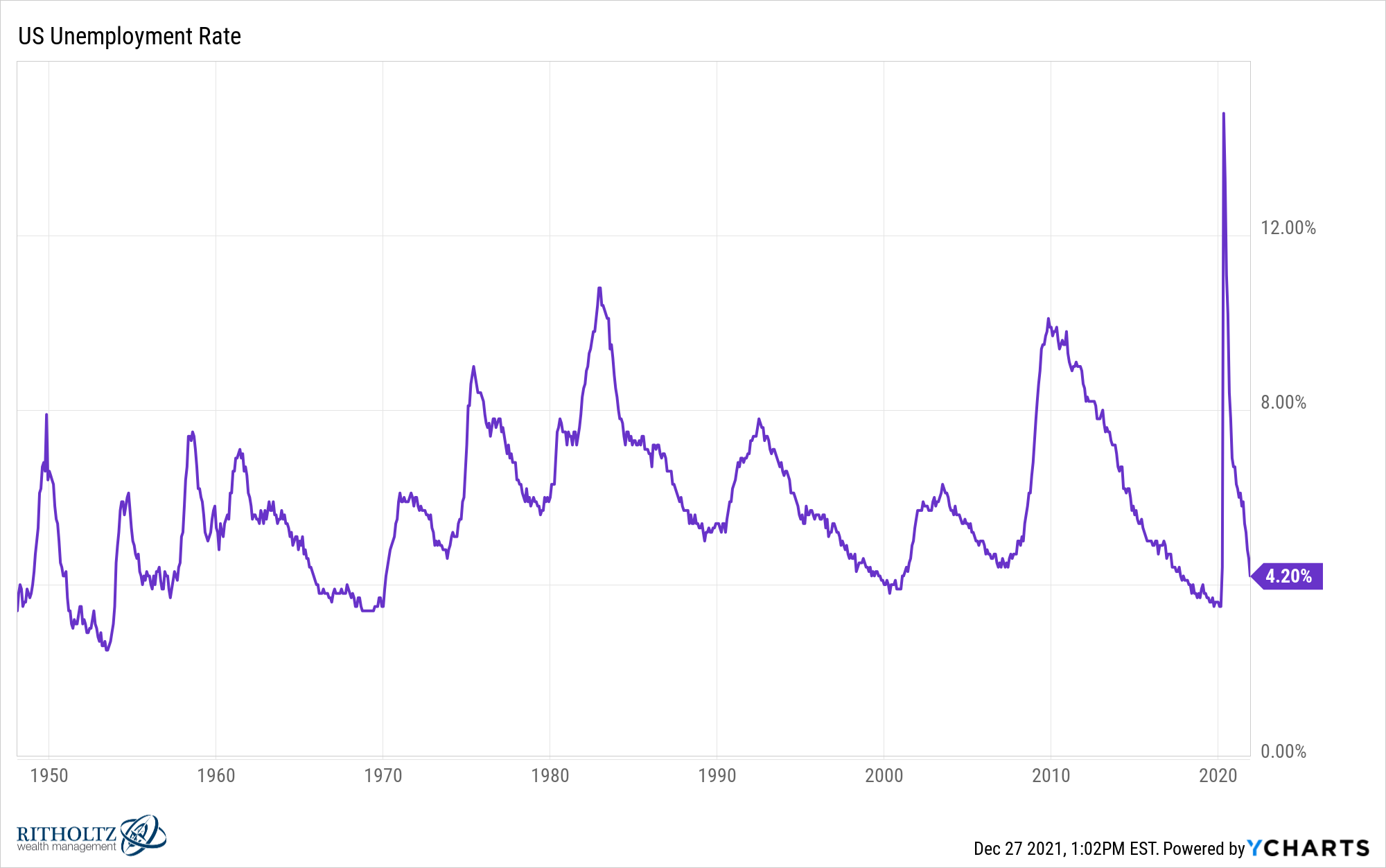
In 2020, the pandemic broke economic charts for good. Take the unemployment rate for instance:
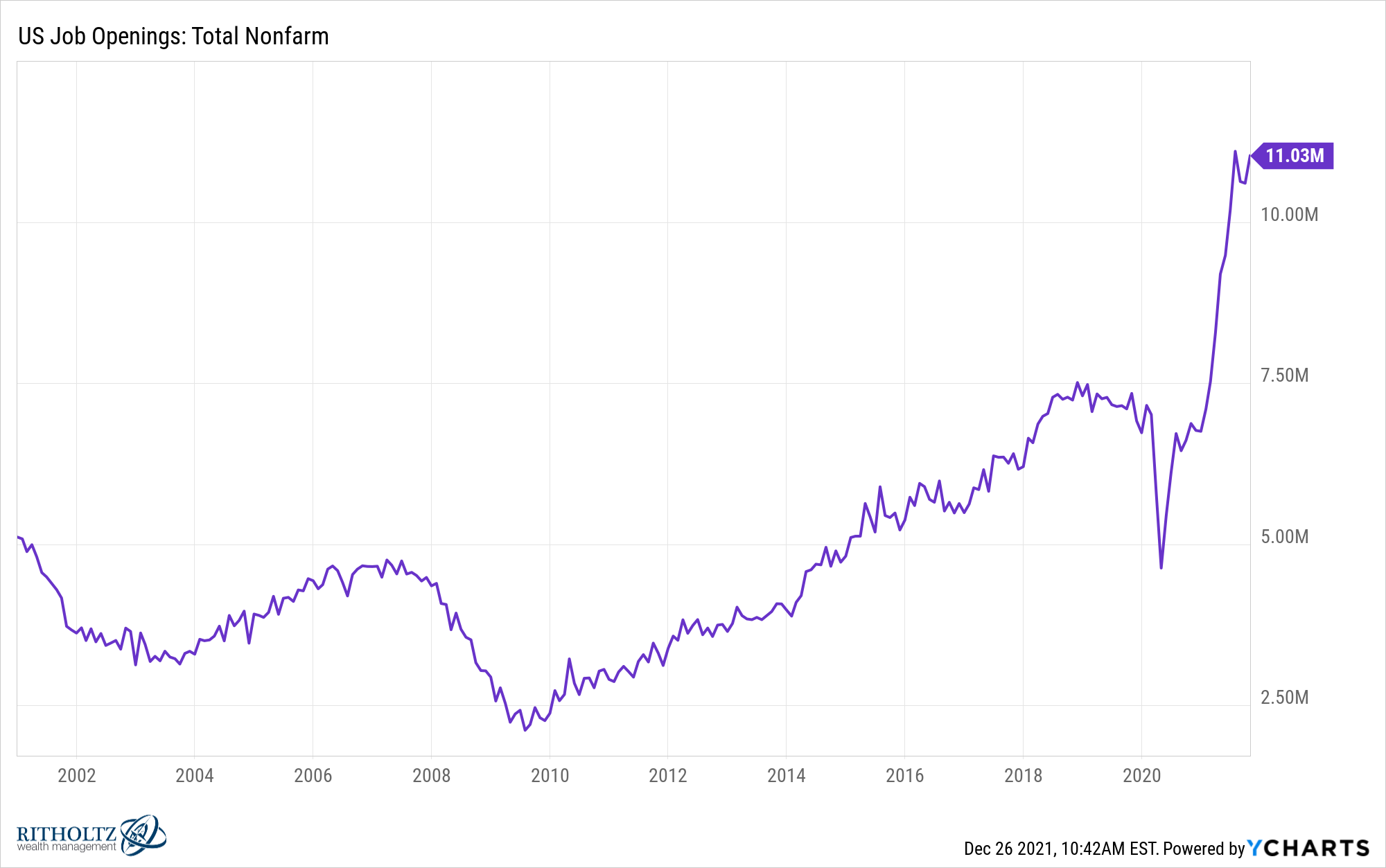
This year was all about labor market shortages. Look at the number of job openings:
Even more impressive might be the number of people quitting their job:
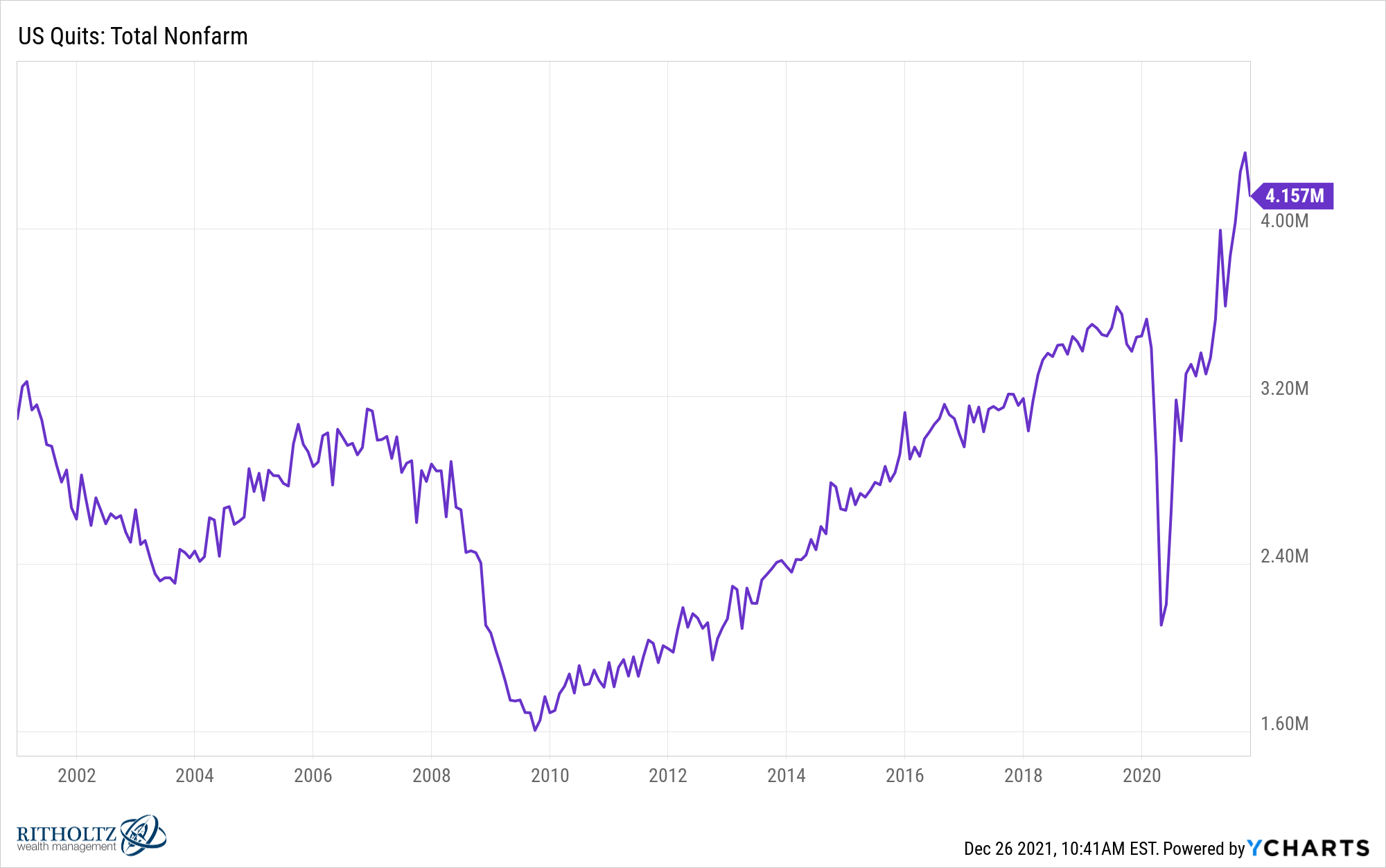
It’s hard to wrap your head around the fact this is a good thing on aggregate. Most people only quit their job when they have better opportunities elsewhere. Workers finally have some negotiating power.
Finally, I would be remiss if I didn’t at least mention crypto. Bitcoin had another strong year even in the face of multiple gut-wrenching drawdowns:
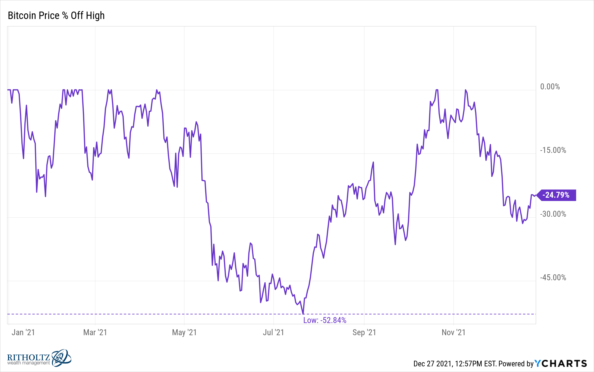
It’s up around 65% on the year but was cut in half, shot back to all-time highs and then lost another one-third of its value.
The speed at which crypto markets move is breathtaking.
How about one more?
The S&P 500 is now up almost 30% on the year:
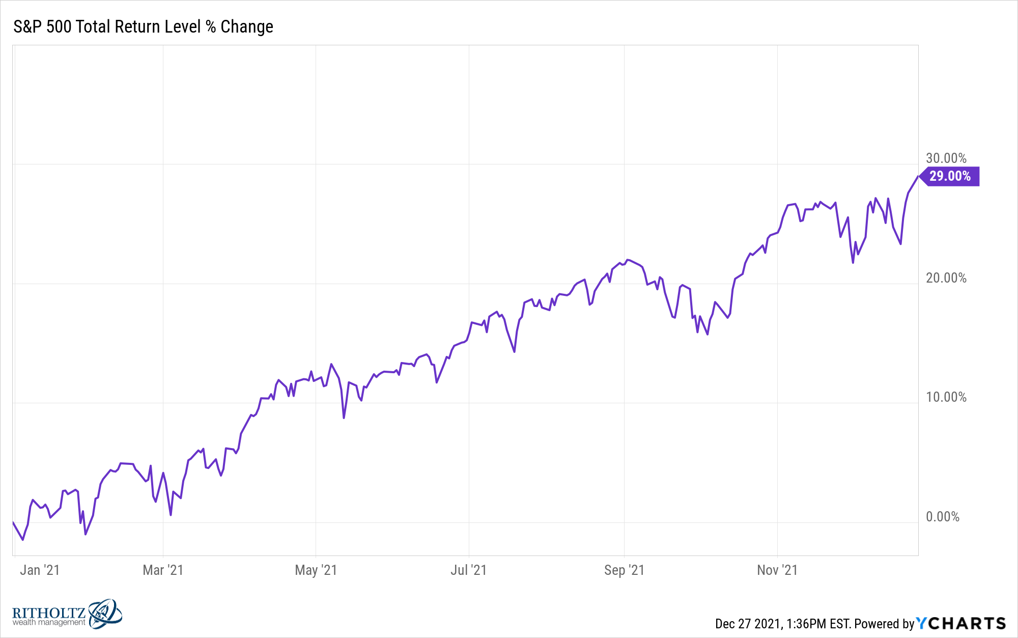
This is following gains of 18% in 2020, 31% in 2019 and 22% in 2017.
I know this won’t last forever but you have to marvel at the amazing run we’ve had in U.S. stocks these past 13 years or so.
Further Reading:
As Good as it Gets?